


Table of Contents
According to the ABA's research, 90% of law firms have a website as of 2024.
But solos and small firms still trail behind larger practices. Even when a site exists, it’s often outdated, takes longer than 2.5 seconds to load, or does nothing to help your phone ring.
And that’s the frustrating part.
You can be a great lawyer and still lose prospects because your website doesn’t explain what you do, who you help, or why someone should trust you (Ugh, frustrating!).
So, what separates the forgettable websites from the ones that book consultations? In this article, we'll break down 64 of the best law firm web design examples (across practice areas and firm sizes!), so you can see for yourself. Keep scrolling.
Want a Site That Pops Up on a Top 10 List?
Grow Law can help. Over 100 clients have boosted their revenue with our top-performing sites!
Book a Free Consultation

What Makes a Law Firm Website Good?
A good law firm website does two things well: it attracts new clients and proves you’re an authority in your primary practice areas.
Below, we cover the core elements that you’ll see time and again on high-performing law firm websites!
- Loads fast and works flawlessly on all devices
- Clear positioning: who you are, what you do, and who you help
- Simple navigation and clean page structure
- Direct, consistent messaging and strong CTAs throughout
- Clear visual hierarchy that guides the visitor’s attention
- Authentic photography, no generic stock images
- Trust-builders: client reviews, case results, awards
- Easy-to-find contact info and online booking or intake
- Plain, human language, not heavy legal jargon
- Unique brand voice, not a cookie-cutter template
- SEO-friendly and technically sound (secure, up to date)
All in all, a great website makes it easy for the right clients to find you, trust you, and take action, without confusion or friction.
Best Law Firm Website Design: A Grow Law Portfolio
The following law firm websites showcase our commitment to creating impactful digital presences for legal professionals. Each design reflects careful consideration of the law firm's name, goals, and target audience, resulting in websites that not only look impressive but also effectively convert visitors into clients.
1. Hagestad Law Group

HagEstad Law Group is a great example of how a clean, confident website can bring you clients.
The design is simple and sharp — gray-white colors, a bold headline, "Protecting Your Legal Interests", and immediate clarity around their primary practice areas.
When you first scroll, you know who the firm helps, what they handle, and how to get in touch.
Plus, the trust factor is baked in everywhere: dozens of 5-star reviews, mentions of $10M+ cases resolved and 95% won, and 50 years of combined experience. Nothing is buried.
And it paid off! After the website redesign, the firm saw 228% more qualified leads and a 67% jump in conversion rate.
2. Omar Ochoa Law

Omar Ochoa Law’s website grabs attention instantly! You're drawn to the picture of Omar front and center, with a bold headline: "Over $1 Billion Recovered."
There's zero confusion about the firm’s primary practice areas: serious civil litigation and personal injury cases, along with 4.8-star ratings across 300+ reviews. You'll also see a form right up top to convert anxious, desperate leads.
But this site doesn’t just look strong — it performs. After the redesign, the firm went from a respected local name to a statewide force, driving a 3,345% marketing ROI, 1,000% more qualified leads, and a 1,018% increase in conversions.
It’s a masterclass in how to build a high-converting site.

3. Yarborough Law Group

Yarborough Law Group’s website immediately puts you at ease.
Its warm color palette inspires comfort, paired with the headline “The Finest Family Law Representation Throughout Oklahoma City." The up front attorney photo is a brilliant touch.
Then, you see 4.9-star ratings across 30 reviews, which is what every anxious prospect needs to see. The site stays focused on what matters most: family law, trusted guidance, and clear next steps.
Behind the scenes, a full website redesign unlocked those results — driving an 857% ROI, 452% more qualified leads, and explosive growth in organic traffic.
Want your firm featured next?
Submit your website to info@growlaw.co. If it meets our criteria, we’ll consider it for our next Top Law Firm Websites list.
4. Gounaris Abboud

Gounaris Abboud’s website makes its point immediately. An autoplay video of their attorneys at work pulls you in right away, paired with the bold promise “Unyielding Advocates. Unwavering Results.”
From there, the site does exactly what a top criminal defense website should! It highlights 50+ years of combined experience, a 95% success rate, and hundreds of 5-star reviews.
Practice areas are clear. Case results are front and center. A Free Case Analysis is always one click away, reinforced by 24/7 availability.
Their website redesign delivered, with 124% more qualified leads, 112% higher conversions, and 522% growth in organic traffic.
5. Jacob D. Fuchsberg Law Firm

You'll love the Jacob D. Fuchsberg Law Firm’s website.
The homepage opens with the empathetic promise “We Can Help When the Unimaginable Happens." You're then treated to multimillion-dollar verdicts, civil rights wins, and medical malpractice recoveries right up top.
The trust really stacks up as you scroll. The firm’s mission, decades of advocacy, and attorney profiles reinforce authority without feeling cold.
Strong CTA headers like "Tell Us What Happened — We’ll Handle the Rest!" are really reassuring and make you stick around long enough to contact them.
With their strategic website overhaul, they saw 196% more qualified leads and a 200% growth in organic traffic.
6. Barr & Douds Attorneys
.avif)
The homepage opens with a striking, formal image of a judge’s courtroom chair and no-BS copy: "Barr & Douds Attorneys in Danville, CA"... letting you know where they operate!
From there, the message is clear and focused: this firm handles contested trusts, estates, elder law disputes, and fiduciary litigation.
The site doesn’t overexplain. It shows proof. Visitors immediately see the firm’s depth of experience — serving clients since 2007, 200+ trust administrations, 400+ estate plans, and hundreds of litigation and securities cases.
The clear calls to action like "Get a Free Consultation" across the page make this a masterclass in great website design.
7. Stracci Law Group

The best law firm websites combine trust, clarity, and education to win more clients. A strong, visually appealing hero banner with a headline like “The team that stands behind you” paired with photos of attorneys builds an immediate personal connection. This site is clean, organized, and loaded with helpful info like detailed service overviews, attorney bios, and media mentions to boost credibility.
They stand out by explaining legal terms and processes, not just listing practice areas, offering real value to visitors. The legal marketing results speak for themselves: a 1,354% increase in qualified leads, a 1,927% boost in conversions, and 2,900% more organic traffic. This marketing strategy humanizes the firm, fosters trust, and makes clients feel confident about reaching out.
8. Cohen & Marzban

This site strikes the perfect balance between confidence and clarity. Strong calls to action, and real attorney photos make it immediately personal. The layout? Clean. The info? Spot-on, with helpful content that explains not just what they do, but how they do it, and what clients can expect.
The legal marketing strategy behind the website delivered serious results: a 62.5% increase in marketing qualified leads, a 39% drop in cost per lead, and a whopping 704% ROI. That’s not just law firm web design, that’s design with a bottom-line purpose.
9. Fellows Hymowitz Rice
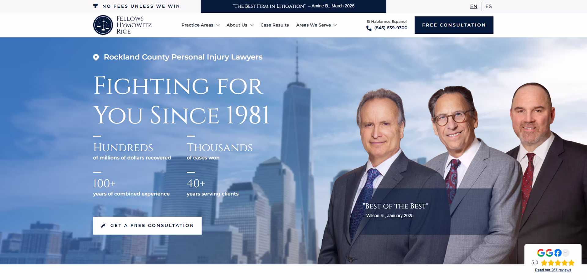
This site leads with compassion and trust, and it works. They show real client stories, break down their legal process in plain English, and highlight verdicts in a way that feels human, not braggy. It’s clear these guys care, and the website proves it.
Our new marketing strategy brought in a 223% jump in qualified leads and cut the cost per lead by 29%. That’s what happens when you make your website about your clients - not just your firm.

Ready for Your New Site?
Get started in 2 minutes. Contact Grow Law, and we'll build you a site that gets more leads, more clients, (and yes!), way more revenue.
Book a Free Consultation
10. Ryan Deck Law
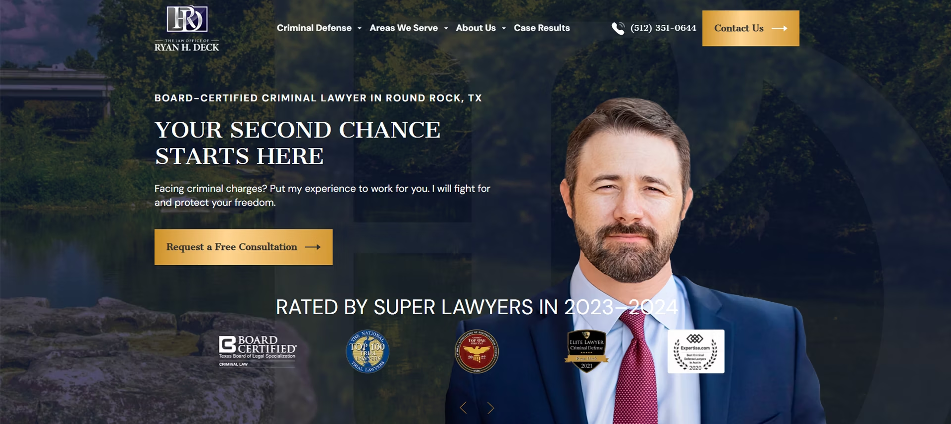
Here’s how you make a solo firm look top-tier: clean visuals, bold messaging, and content that actually answers the questions people are Googling. Ryan Deck’s website builds instant credibility with a confident headline, strong social proof, and educational content that explains criminal defense without the fluff.
And it’s paying off: 136% more qualified leads. That’s the power of showing up online the right way.
11. CohenMalad Trial Lawyers
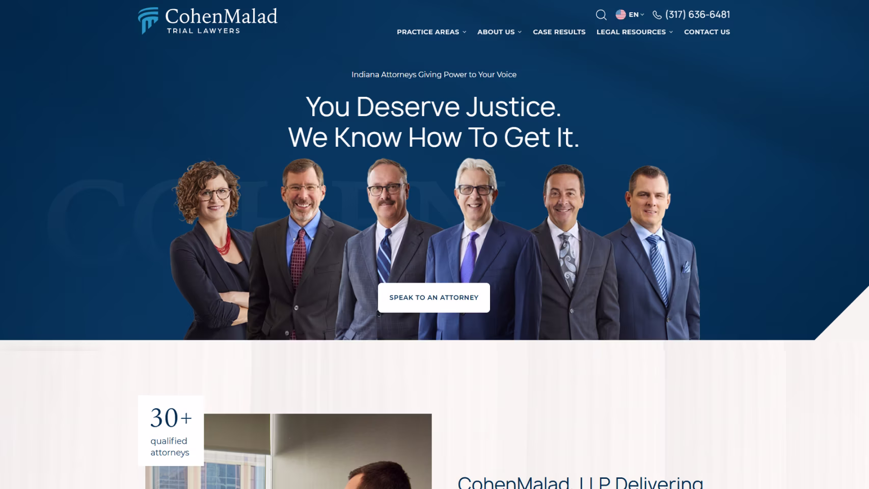
This is a great option for your shortlist! CohenMalad opens with a friendly, professional team photo, immediately humanizing a large trial firm. They reinforce their promise, “Indiana Attorneys Giving Power to Your Voice.”
It strikes a balance many firms miss: approachability and authority.
Right away, visitors see scale and experience — 30+ attorneys, 300+ years of combined experience, and over $1 billion recovered. Their practice areas are clearly organized, making it easy to find the right path. Use this as inspo for your site!
12. Michles & Booth
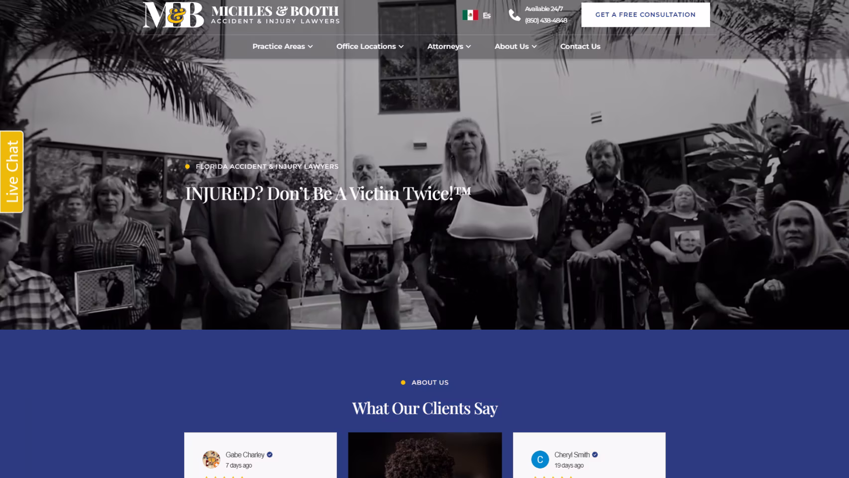
Michles & Booth’s website opens with a cinematic, emotionally powerful header featuring real injury victims.
It's paired with the bold line “INJURED? Don’t Be A Victim Twice!” The message hits home for people who are scared, overwhelmed, and unsure where to turn next.
As you scroll, credibility builds fast. Clear practice areas, 20+ years of experience across Northwest and Central Florida, and substantial jury verdicts reinforce trust without legal jargon.
The site inspires action with a strong attorney presence, visible results, and 24/7 access to a free consultation.
13. Tomkiel & Tomkiel

Tomkiel & Tomkiel’s homepage is a great study in masterful web design. It opens with a strong, confidence-building header image of the two attorneys front and center.
Right away, the site leans into trust: “Helping Injured New Yorkers for Three Generations”.
The navigation makes it easy to find exactly where you fit. With 30+ case types, from car and construction accidents to catastrophic injuries and medical malpractice, you don’t have to guess whether the firm handles your situation.
Plus, their massive verdicts seal the deal — including $140M, $60M, and $13M outcomes. Free consultations and Zoom call options remove friction for people who need help.
14. Texas Horizons Law Group
.avif)
Have you seen Texas Horizons Law Group’s website yet? The first thing that hits you is the striking attorney photography.
Right at the top, the homepage greets visitors with “Your Dedicated Texas Attorneys”, followed by a clear CTA: “Schedule a Consultation.”
One standout detail: the firm highlights 80+ years of combined experience and emphasizes that several attorneys are board-certified in real estate and oil & gas law.
They even have compelling client success stories, like a $16.5M coastal property sale and complex estate planning cases for blended families.
That clarity paid off fast: their website redesign helped drive a 377% increase in organic traffic, a 494% jump in qualified leads, and a 510% marketing ROI.
15. KJT Law Group
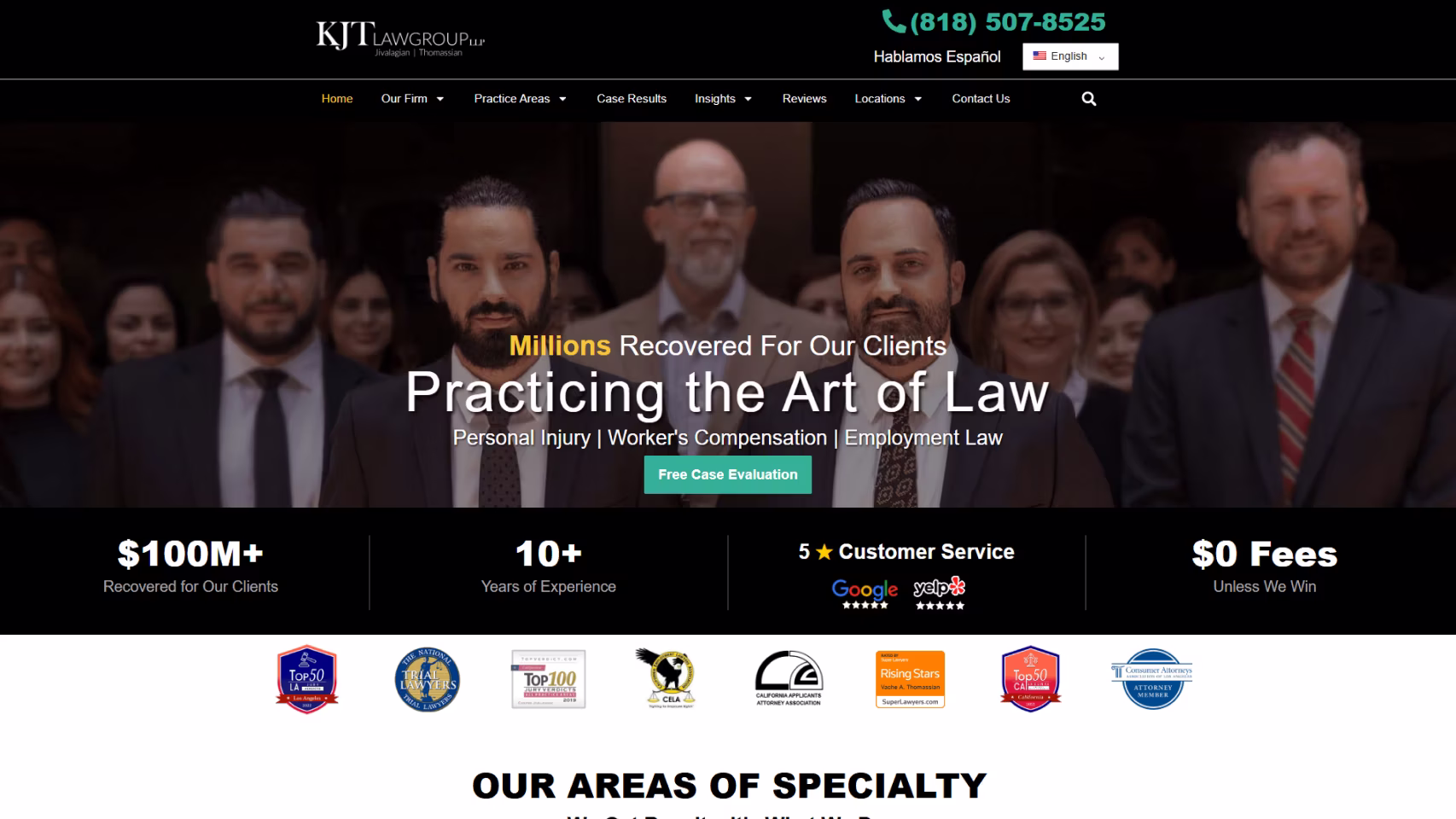
This one grabs you instantly! KJT Law opens with a bold, confident team photo and the headline “Millions Recovered For Our Clients."
The homepage backs that up with numbers front and center: $100M+ recovered, 20+ years of experience, 5-star Google and Yelp reviews. This is a great reassurance for visitors.
What really works is how human it feels. The site highlights direct attorney access, multilingual support (Spanish & Armenian), and real verdicts like $16M, $6.9M, and $3M wins, all without overwhelming the reader.
After optimizing KJT Law Group’s website, they drove a 405% increase in qualified leads, cut cost per lead by 50%, and boosted paid traffic by 221% — helping the firm break out in LA’s ultra-competitive market.
16. Cameron Law
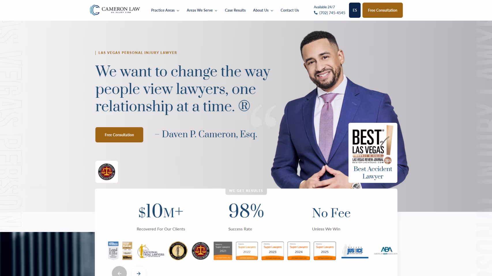
You don’t have to scroll far to understand what Cameron Law is about. The site makes its point fast — "We want to change the way people view lawyers".
Immediately below that, you see mentions of $100M+ recovered, a 98% success rate, and a clear “No Fee Unless We Win”.
Cameron's practice areas are organized cleanly, settlement amounts are impossible to miss, and CTAs like “Free Consultation” and “Available 24/7” show up clearly.
What we love is how the language is direct, the proof is visible, and nothing feels overproduced or salesy.
After a conversion-focused redesign and SEO strategy, Cameron Law achieved a 367% lift in qualified leads, a 1,011% increase in conversion rate, and a 350% marketing ROI, creating a steady, reliable intake pipeline.
17. Exceed Legal
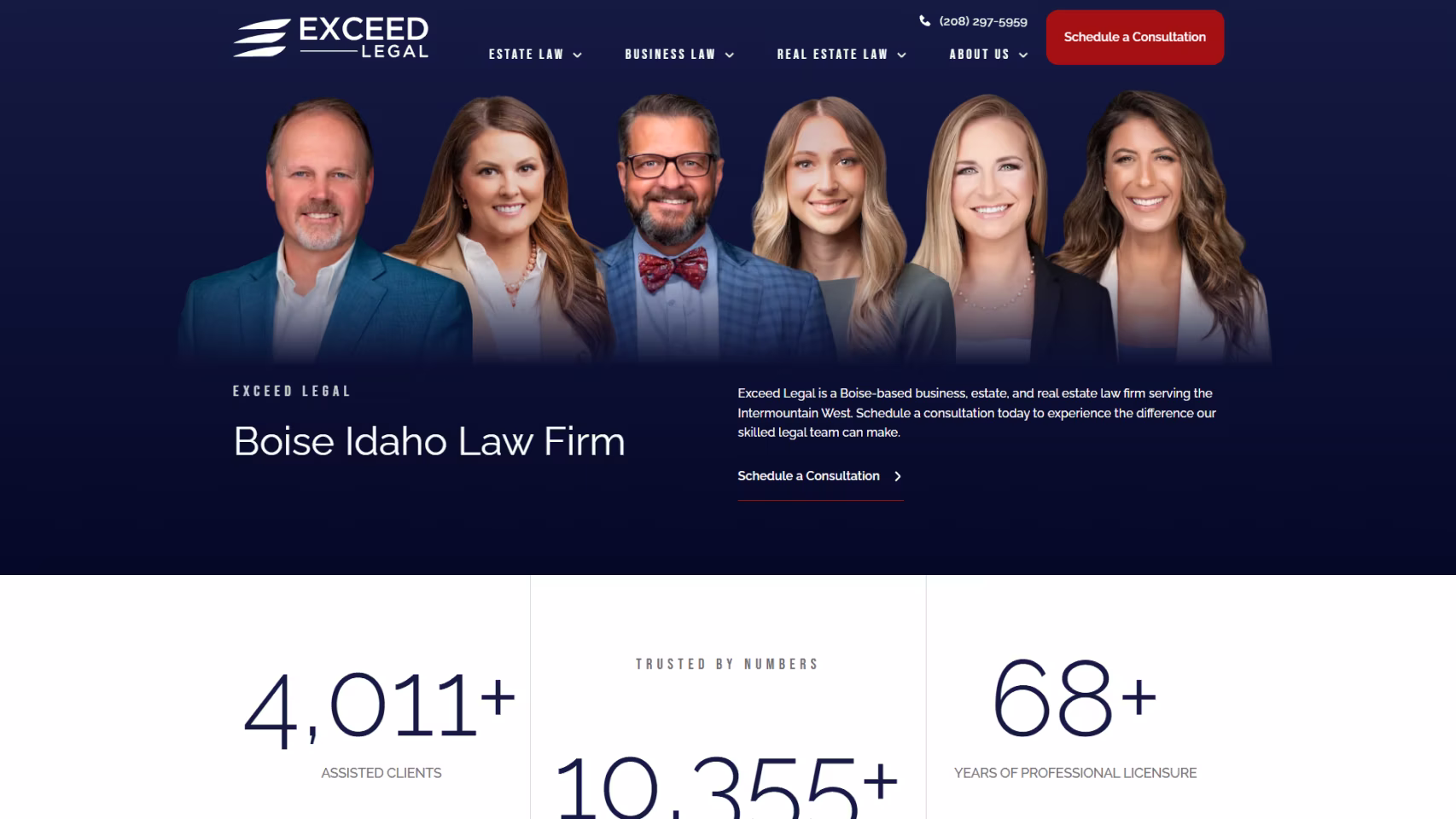
The header hits immediately with a strong attorney team photo. Exceed Legal's homepage leads with real proof: 4,011+ clients assisted, 10,355+ matters resolved, and 68+ years of combined licensure.
You'll notice plain-spoken sectioning and CTAs like “Schedule a Consultation” and “We Are Here to Help” make the site feel approachable without losing professionalism.
Overall, this is a polished, trust-forward website that makes it easy to understand who they help, how they help, and what to do next.
After a strategic rebuild, Exceed Legal saw a 1,700% increase in qualified leads and doubled monthly case volume from 12 to 24 — all while keeping their personalized, high-touch approach intact.
18. Rice & Kendig
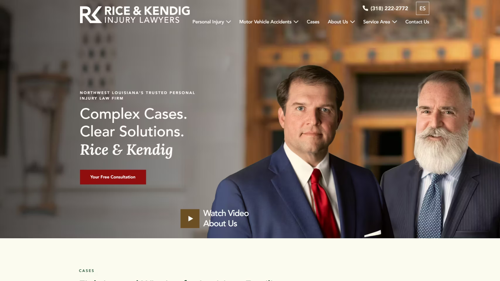
Rice & Kendig leads with confidence: $156M+ recovered across Northwest Louisiana.
Instead of long-winded promises, they show proof: Multi-million-dollar recoveries, 40+ years of courtroom experience, and a clear message — they take on the cases other firms won’t.
What really stands out is how human it feels. Direct attorney access. Bilingual advocacy. A family-first approach that’s been in place since the 1970s. You’re never hunting for credibility here.
After a focused digital overhaul, Rice & Kendig turned a strong local reputation, generating 1,352% marketing ROI, a 537% jump in qualified leads, and a 701% increase in conversion rate.
19. Sakkas, Cahn & Weiss
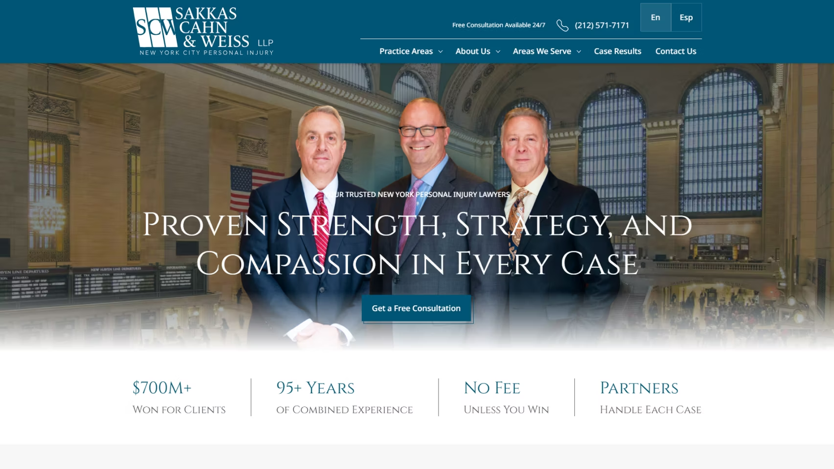
Sakkas, Cahn & Weiss' site makes its point fast. Right off the bat, it kicks off with a strong header: "Proven Strength... Compassion in Every Case."
You'll also see a strong team photo, clear messaging, and hard numbers upfront: $700M+ recovered, 95+ years of combined experience, and no fee unless you win.
Anxious prospects get treated to case results like $19.5M for a brain injury, $14.3M for a truck accident, $ and $11M for a defective vehicle.
The firm feels big but accessible. Partners handle each case, consultations are available 24/7, and offices span NY, NJ, and CT. This is definitely worth adding to your design inspo shortlist!
20. Leah Wise Law Firm

The site shows off Leah Wise's personality immediately. Bold red, unapologetic messaging, and zero hesitation about results.
Right off the bat, it makes one thing clear: this firm moves fast, hits hard, and fights for maximum compensation.
This law firm also spotlights impressive wins: $100M+ recovered, 778 Google reviews, and headline wins like $7.5M for a construction accident and policy-limit car crash settlements.
The “CrashGal™” branding is confidence backed by numbers. You'll see accessibility markers like mentions of offices in South Texas and Houston, bilingual support, and 24/7 availability.
21. Lishman Law Firm
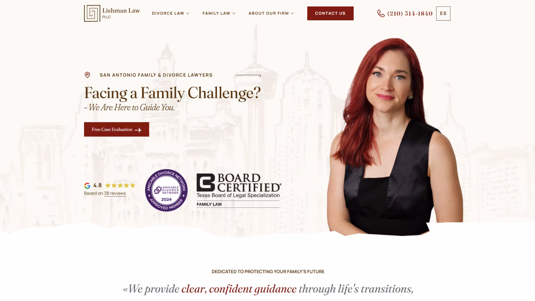
Modern and minimalist, this site keeps attention where it belongs: on clients. Strong typography and precise copy communicate professionalism without clutter. Practice pages are streamlined, emphasizing clarity and efficiency. It’s an elegant digital presence that mirrors the firm’s practical, no-nonsense approach to criminal defense in Texas.
22. The Marshall Defense Law Firm

This website handles a delicate subject with grace and empathy. Soft color tones, measured language, and resource-rich content assure clients facing sensitive criminal allegations. The design prioritizes dignity and understanding, transforming a difficult search into a sense of relief and hope, hallmarks of a truly client-aware firm.
23. Ochoa & Calderon
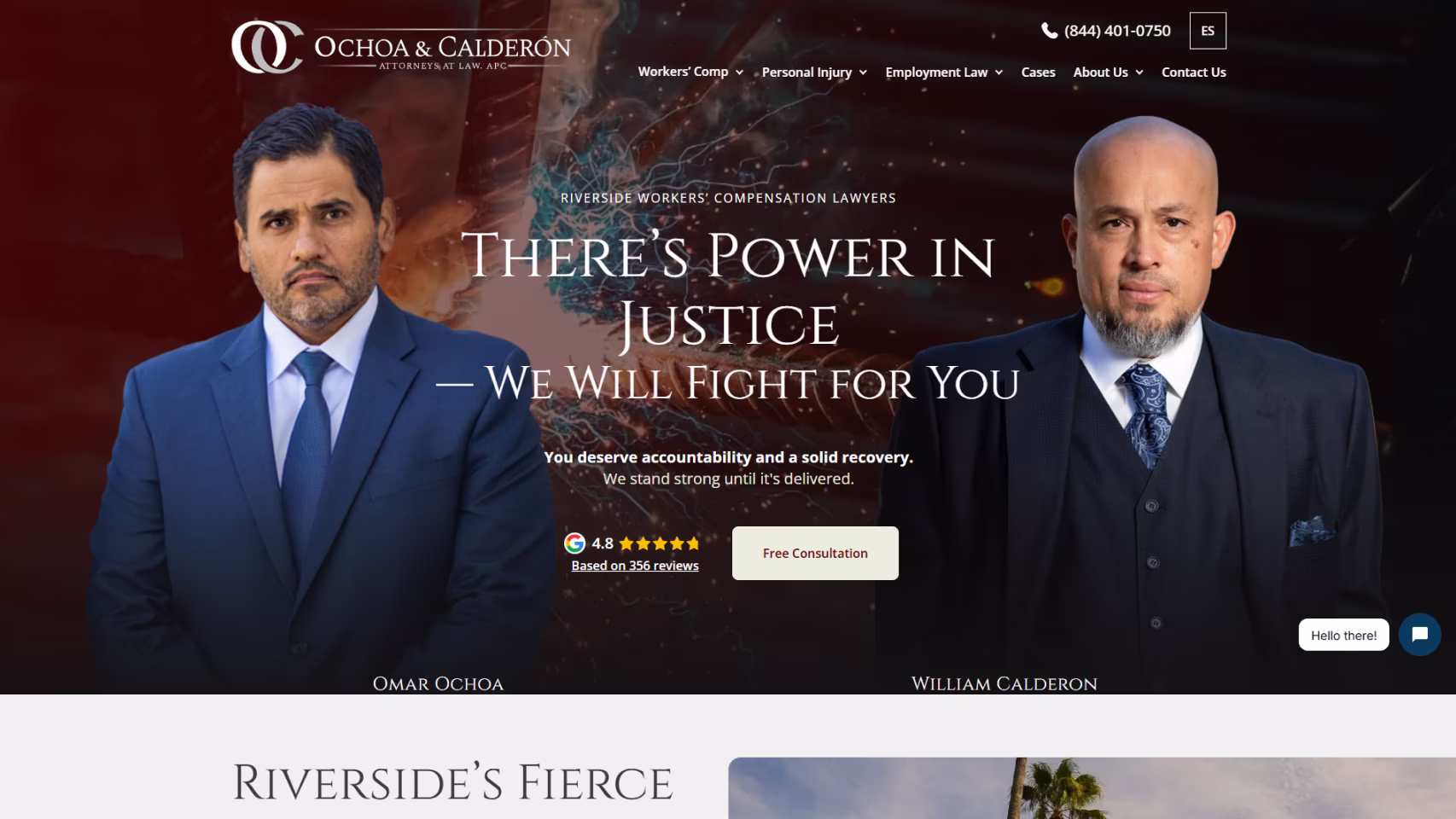
A polished bilingual site that reflects dedication to justice and community. Straightforward navigation, human-centered imagery, and transparent messaging make it easy for Spanish- and English-speaking clients to connect. The design successfully balances professionalism with cultural approachability, creating a welcoming, trustworthy online presence.
24. The Law Offices of Blake A. Poole
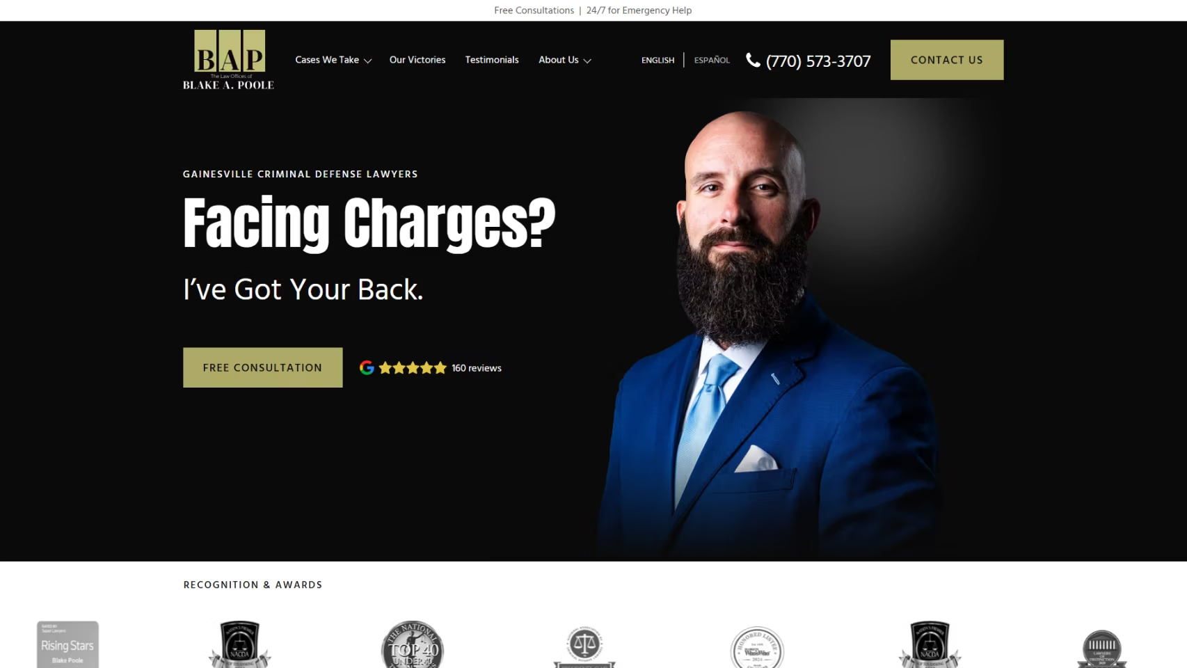
Simple, direct, and dependable, this site gets straight to the point. Clear CTAs, clean navigation, and reassuring copy help visitors quickly understand their legal options. It demonstrates that effective web design doesn’t require flash, just confidence, clarity, and a sincere commitment to helping clients move forward.
25. Hopper Hopper & Strebe
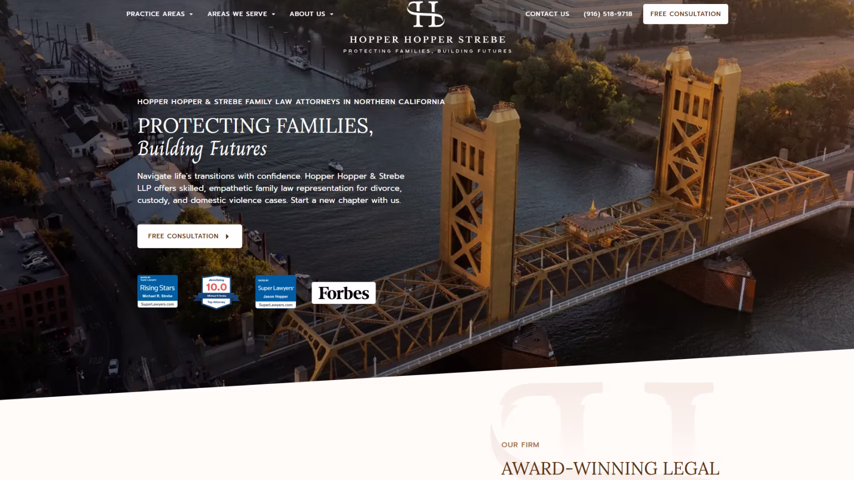
This family-law website balances professionalism with compassion. Soft imagery, calming colors, and empathetic copy guide visitors through emotionally charged topics. Straightforward explanations and visible contact points make complex processes feel manageable. It’s a supportive digital space built for trust and clarity.
26. Applewhite Firm
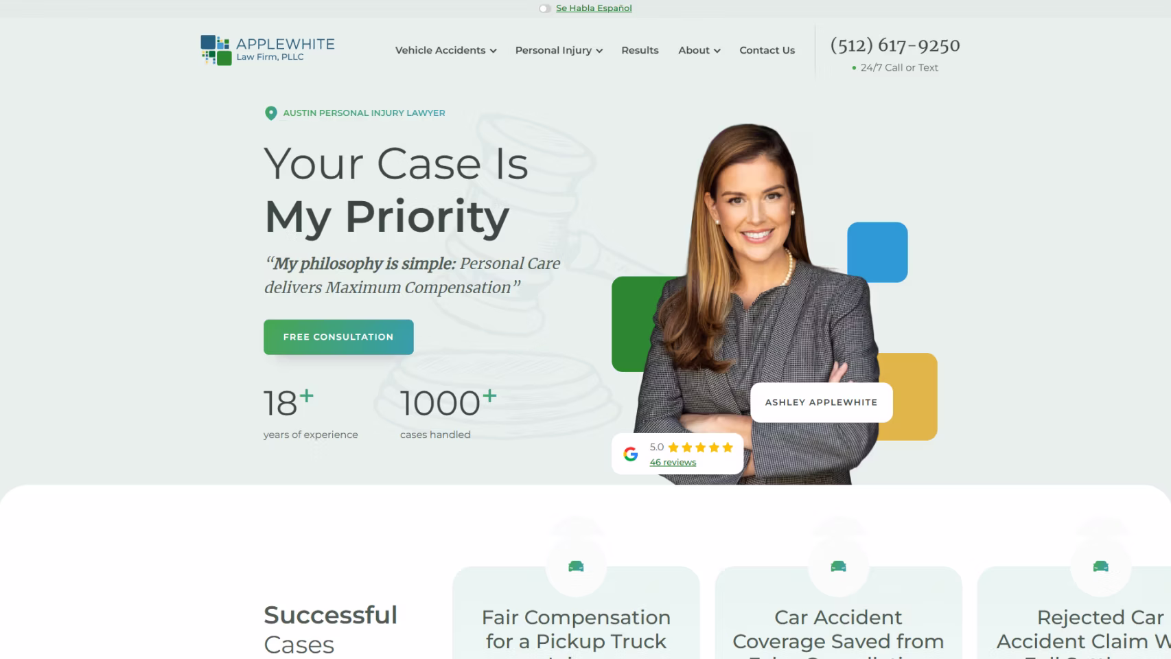
Applewhite Firm’s site is concise, personal, and polished. Its design emphasizes approachability, with clean visuals and clear CTAs that help visitors reach the attorney quickly. The language is confident yet human, showcasing dedication to clients while avoiding unnecessary complexity, a professional yet personable reflection of Ashley Applewhite’s practice.
27. HHT Law Corp
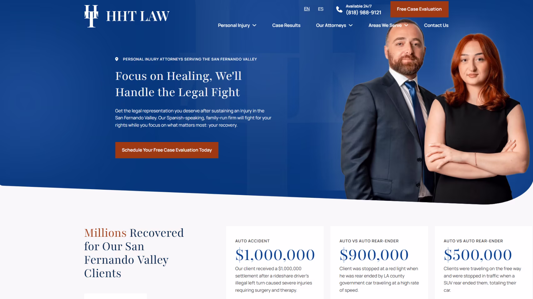
Sleek, understated, and professional, this site delivers a strong corporate impression. Crisp typography, balanced visuals, and succinct service descriptions position the firm as efficient and trustworthy. The user experience is seamless, projecting quiet confidence and competence without distraction.
28. AF Law Firm
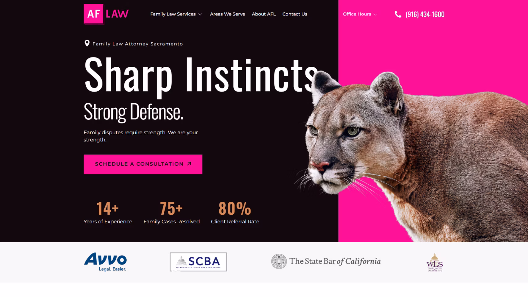
AF Law Firm’s website stands out for its modern layout and confident tone. Bold colors and simple navigation create a clear client journey from information to consultation. With concise copy and accessible design, it presents a professional, straightforward image ideal for family-law and immigration clients seeking reassurance and clarity.
Looking to Elevate Your Law Firm's Online Presence?
Our team at Grow Law Firm specializes in creating the best law firm websites that exemplify innovation, professionalism, and conversion-driven design.
Schedule Free Consultation Now!
29. Randall McKinney Law

Randall McKinney Law takes a bold approach with their website design, opting for striking simplicity on their homepage. Visitors are greeted with a hero image of an old boxing glove, accompanied by the powerful headline "Always fighting for you. YOUR FUTURE IS OUR BUSINESS". This minimalist approach creates an immediate impact and clearly communicates the firm's combative stance in defending their clients.
While the homepage may seem sparse at first glance, it's a strategic choice that draws visitors to the hamburger menu. This design decision guides users to actively engage with the site, exploring the firm's services, blog, and contact information at their own pace.
30. Ylaw Group

The Ylaw Group's website for their family law practice is a breath of fresh air in the often serious world of law firm websites. The site uses various shades of purple, creating a warm and inviting atmosphere that aligns well with their focus on family law.
What truly sets this site apart is its playful and personable approach. The hero image features the firm's lawyers engaged in various activities – playing a ukulele, mini golf, and reading a newspaper – while still maintaining eye contact with the camera. This unique presentation humanizes the attorneys, making them appear approachable and relatable – crucial qualities for family lawyers.
As you scroll down, you're treated to more whimsical images, like someone sitting on a stack of mattresses or riding a bicycle. These images are cleverly integrated with information about the firm's services, attorneys, and contact details.
This fun and playful approach works exceptionally well for a family law firm. It helps to alleviate some of the stress and anxiety that often accompanies family legal matters, presenting the firm as an understanding and approachable partner in navigating these challenging situations.
31. Bouhan Falligant

Bouhan Falligant's website immediately captures attention with its striking color scheme of yellow, black, and white. The hero section features eye-catching images paired with headlines that highlight the firm's longevity and value. This visual storytelling effectively communicates the firm's established presence and expertise at a glance.
As visitors scroll down, they're treated to a wealth of information that justifies the firm's impressive tenure since 1886. The site provides detailed insights into the firm's history, attorneys, and approach, all presented in a clean, easily digestible format.
Interestingly, the lower part of the homepage breaks from convention by including only social media links, rather than the typical sitemap or additional navigation options. This clean, focused approach keeps the user's attention on the most important elements and makes the site accessible.
32. Stanchieri Family Law

The Stanchieri Family Law website stands out with its clean, modern design and innovative use of a slide-scroll method. The color palette is simple yet effective, primarily using black with touches of red and white.
One of the most notable features of this site is its use of a hamburger menu. This design choice keeps the top of the page uncluttered, allowing the firm's branding and key messages to take center stage. It's a bold move for a website, but one that pays off in terms of aesthetic appeal and user experience.
As visitors scroll through the homepage, they're presented with brief, impactful information about the firm, its services, and calls to action. The concise nature of this content makes it easy for prospective clients to quickly grasp the firm's offerings and take the next step.
33. Gecić Law

Gecić Law's website is a masterclass in modern, sophisticated web design for law firms. The site primarily uses black with touches of red and white, creating a sleek, professional aesthetic that immediately commands attention.
What sets this site apart is its innovative use of a scroll/slide pattern, featuring five distinct sections that each highlight different aspects of the firm. The homepage greets visitors with a striking hero video showcasing various scenes - from cityscapes to stadiums and refineries. This visual journey effectively communicates the firm's wide-ranging expertise and global reach.
The site also features well-organized sections on their team, services, and insights. These areas provide depth without overwhelming the visitor, striking a perfect balance between information and aesthetics.
Take advantage of our web design services to build a strong web presence for your business. Our experienced design team can create a stunning, modern website tailored to your firm's needs.
34. Staver Accident Injury Lawyers

The Staver Accident Injury Lawyers website is a standout example of a personal injury law firm effectively using web design to engage and inform potential clients. The site employs a vibrant color scheme of white, blue, and orange, creating an energetic yet professional aesthetic.
Unlike many law firm websites that place contact details at the bottom of the page, Staver positions this crucial information at the very top. This strategy makes it incredibly easy for potential clients to reach out, potentially increasing conversion rates.
As you scroll down the homepage, you're presented with an impressive array of information. The firm's credentials are front and center, showcasing their years of service, Google ratings, and case results. This data-driven approach builds credibility and trust from the outset. Another noteworthy feature is the EN/ES toggle for language selection, catering to Spanish-speaking clients. This inclusivity can be a significant advantage in serving a diverse client base.
35. The Law Offices of Bryan R. Kazarian

The website for the Law Offices of Bryan R. Kazarian, a criminal defense practice, stands out with its bold use of vivid blue and red colors. Visitors are immediately presented with key information about the firm's track record, including numbers that highlight the firm's experience and success rate. This data-driven approach builds credibility right from the start.
The site goes beyond just listing services by providing detailed answers to frequently asked questions about criminal defense. They also did well in detailing successful cases. The inclusion of client reviews and industry awards further bolsters the firm's credibility. These trust signals are strategically placed throughout the site, reinforcing the firm's reputation at multiple touchpoints in the user journey.
36. BD & P

The website for Burnet, Duckworth & Palmer LLP (BD&P) sets a high bar for what constitutes the best law firm website. Its modern, engaging design breaks away from the typical law firm website mold, offering visitors a refreshing digital experience.
The site employs parallax scrolling, an interactive design technique that creates depth and engagement as visitors explore the page. Another innovative element is the inclusion of a newsletter subscription option at the top of the page. This demonstrates the firm's commitment to ongoing client communication and positions them as thought leaders in their field.
The site's navigation is thoughtfully designed, featuring both a drop-down menu and a hamburger menu. This dual approach ensures that visitors can easily access important information about the firm and its services, regardless of their browsing preferences.
37. Vogel LLP

Vogel LLP's website takes a unique approach in the world of law firm websites, opting for simplicity and impact over extensive scrolling. The homepage is strikingly minimalist, featuring only essential elements that make a strong first impression.
The standout feature of this site is its prominent display of the firm's 200-year experience track record and recognition by Best Lawyers. While the homepage may seem sparse, the comprehensive navigation bar provides easy access to detailed information about the firm's expertise, resources, and contact information.
The minimalist homepage also features the firm's Google rating and Best Lawyer badge prominently, along with links to their social media channels. These elements enhance credibility and provide additional avenues for potential clients to engage with the firm.
38. Andreozzi + Foote

The website for Andreozzi + Foote, specializing in sexual abuse cases, takes a thoughtful and sensitive approach to its design and content. Recognizing the delicate nature of their practice area, the firm has made some unique and commendable choices in their web design.
Perhaps the most striking feature of this site is its use of client testimonials as the primary content on the homepage, rather than a list of services. While the site is text-heavy, it's also highly informative, providing answers to common questions and offering news and insights related to sexual abuse cases. This wealth of information serves as a valuable resource for victims who may be seeking legitimate recourse.
39. Chadi & Company

Chadi & Company's website excellently demonstrates how a multi-practice law firm can present its diverse services in a clear, user-friendly manner. One of the standout features of this site is its implementation of live chat. This tool helps direct visitors to relevant sections quickly, enhancing the user experience and potentially improving client acquisition rates.
The homepage is designed to provide comprehensive information about each practice area without overwhelming the visitor. As you scroll, you're presented with a well-organized breakdown of the firm's various legal services, making it easy for potential clients to find the specific help they need.
Interspersed throughout the site are trust-building elements such as reviews, ratings, awards, badges, and media mentions. These are strategically placed between content sections, reinforcing the firm's credibility as visitors explore the site.
40. Bend Law Group

The Bend Law Group's website stands out with its targeted approach to a specific clientele: startup and small business owners. This focus is immediately apparent in their tagline, "Dream big, we've got your back," which resonates strongly with entrepreneurial spirit.
The site's design is refreshingly simple, utilizing a single-page scroll format that presents all key information concisely and engagingly. Furthermore, the homepage prominently displays recognition from reputable publications such as Business Insider and The Washington Post.
The site also incorporates a unique element: an introductory video accessible through the hero slider to add a layer of approachability to the firm, allowing potential clients to connect with the attorneys before even making contact. While the site may lack some of the bells and whistles seen in other law firm websites, its straightforward approach is likely to appeal to its target market of busy entrepreneurs and small business owners who appreciate efficiency and clarity.
Get the Best Law Firm Website Design
Partner with Grow Law to build a lawyer website that attracts clients and drives results.
Get a Free Consultation
41. Vela Wood

Vela Wood's website opens like a Netflix intro. They have an autoplay, black-and-white drone shot video of the Dallas skyline with a strong header, " We’re Here to Help."
The whole vibe is boutique, modern, business-forward. They position themselves as full-service with a local feel and global impact. You'll also notice they get super specific with what they actually do: M&A, Sports & Gaming, Venture Capital, and Corporate Transactions.
And the best part is: They don’t just say they’re helpful — they show it with assets founders actually use: podcasts, a 500+ term Venture Glossary, and “Venture Deals in Review.”
42. Bick Law LLP

This is the most fun website on our list!
The header has bold, playful animal imagery: a wolf for “Leading the Pack,” an elephant for “Before the Elephant Enters the Room,” and a rhino for “Mastering the Balancing Act.”
It’s clever, memorable, and instantly signals: we’re experts, but we’re not boring.
Once you’re hooked, the message sharpens! Bick Law makes it clear they live and breathe environmental law — litigation, transactions, compliance, sustainability, and rulemaking.
It’s smart branding for a complex practice area!
43. Bhatt Law Group

Bhatt Law Group's site goes all-in on personal branding. The black-and-orange palette instantly signals confidence and urgency.
Meanwhile, Jay Bhatt’s face is everywhere. You never wonder who’s fighting your case. From the hero section to case results to credentials, the message is clear: this is a trial lawyer, not a volume firm.
You'll also see plenty of proof: $4.2M truck accident, $2.3M auto case, no fees unless you win, and a hands-on team approach where partners stay involved.
This is a classic site that feels bold yet personal... inspiring you to take action.
44. Robbins Firm

Robbins doesn't play by the rules. The fun header (a cartoon gavel smashing a clock) sets the tone right away: "We Don't Waste Your Time or Money."
Instead of generic promises, they get specific. This is a business litigation and regulatory firm in Atlanta, with deep ties in government investigations, securities enforcement, environmental law, real estate litigation, and trial work.
They emphasize an end-game-first strategy for executives and businesses.
Overall, if you want to create a confident, sharp, and intentionally anti-cookie-cutter site, this is your muse.
45. Tremain Artaza

Tremain's site emphasizes the humans behind the lawyers. The homepage opens with 4 simple promises — "Honest treatment. Clear advice. Smart strategies."
This instantly sets expectations right off the bat. Take note of how it's clean, minimal, and clearly built for people who are already stressed about work issues.
Tremain Artaza positions itself as an employee-side employment law firm, focused on wrongful termination, retaliation, discrimination, leave rights, and severance.
With reassuring messaging like "We’ll Work For You," affected employees are instantly inspired to take action.
46. Zafiro Law

Zafiro is how a good legal site should be done!
For one, it clarifies where exactly it operates in the header: "Experienced Family Law & Immigration Law Firm in Seattle."
ZafiroLaw positions itself as a boutique Seattle firm focused only on family law and immigration. What stands out most is the overlap awareness: they openly address how family law decisions can affect immigration cases (and vice versa), which is huge for immigrant families.
Add in multilingual support, immigrant-led attorneys, and a smaller-firm level of attention, and visitors are inspired to contact them ASAP.
Build the Best Online Presence for Your Firm
Our award-winning web designs help lawyers stand out and convert more leads.
Start Your Project
47. ELG Estate Planning

ELG doesn’t try to do everything. They focus only on estate planning and elder law, and that clarity comes through immediately.
The language is steady and educational. You'll also see a step-by-step explanation of consultations → strategy → execution, making the process feel manageable.
What really works is the peace-of-mind framing around "Compassion and Respect."
What we also love is their emphasis on long-term planning. This feels like a firm built for people who want things done thoughtfully and done right.
48. LadyDUI

This site is all-in on personal branding... with tradeoffs.
LadyDUI is image-based, which is bad for SEO. If most copy lives inside images, Google can’t properly crawl or rank the site, limiting long-term organic growth.
That said, the conversion psychology is excellent. Teresa Dinardi is front and center everywhere — friendly, human, reassuring. The bold blue header (“Hope will not fix your Connecticut DUI. Contacting me will.”) instantly shifts panic into action.
Very personal CTAs (“Talk to me right now,” “Text me”) lower friction when visitors are stressed.
49. Dilworth IP

Dilworth's site opens aspirational. The bold “You’re a visionary” framing immediately tells founders, inventors, and innovators: this firm sees you.
Dilworth IP leans hard into mission-driven language (“changing the world,” “improving life for humanity”), which fits perfectly for patent, biotech, and deep-tech clients.
Instead of selling legal mechanics, they sell a partnership. The “8 Pillars of Client Support” makes the value tangible.
You'll also see CTAs like “Let’s Patent the Future™” and “Tell us about your business,” which is exactly what this audience wants.
50. John Michael Bailey Injury Lawyers

John Michael Bailey grabs you instantly! The playful header with a kid shouting through a megaphone with “Make the call. Let’s get it all.” — cuts through the usual heavy PI tone!
From there, the messaging stays personal. Phrases like “Your life is worth the fight,” and the JMB Guarantee make it clear this isn’t a volume firm. They stress responsiveness (same-day communication, 24/7 availability), direct access to John Michael Bailey.
The site balances heart with muscle. Overall, it's energetic, approachable, and built to make calling feel easy.
51. Klotzman Property Damage Law

Klotzman isn't playing around. The bold blue-and-orange color palette feels soothing and confident... perfect for personal injury and insurance fights.
The messaging is clear from the first scroll: "Miami personal injury and property damage attorneys" with a big, obvious “Free Case Review” CTA.
Recent wins like $400K and $325K hurricane claims boost the trust factor, especially when paired with proof like “Over $50 million won for clients.”
Strong visuals, clear practice-area splits (injury vs. property damage), and simple next steps make you want to make that call.
52. Price Benowitz Accident Injury Lawyers

Take a look at Price Benowitz's homepage. Right away, the headline “A Team of Attorneys Ready to Fight For You” sets the tone, backed by a "Free Consultation" CTA front and center.
The copy walks you through exactly what happens next. Plus, there's plenty of proof: $2+ million in a medical malpractice case, $625,000 for a car accident, and $305,000 for wrongful death.
What stands out is how much they emphasize support beyond the court: constant communication, deadline management, and staying involved even after the case ends. This is a full-service legal machine built to carry the load.
53. Maine Criminal Defense Group

The Maine Criminal Defense Group’s homepage is captivating! The lighthouse and crashing waves make for a great header.
The messaging, "We fight to have your charges dismissed", stays focused on the moment clients are actually in... charge, overwhelmed, and needing a clear path forward.
They back that up with specifics: 80+ years of combined experience, offices across Southern Maine, and deep focus on OUI, DUI, and serious criminal defense.
What really builds confidence is their 5-star reviews. The site consistently reinforces one idea: steady guidance when the stakes are high.
54. 9/11 Victim Attorney

Weisfuse & Weisfuse’s homepage leads with purpose!
The headline immediately establishes who they serve, 9/11 victims, and what they help with, reinforced by a prominent eligibility CTA, "See if You're Eligible".
With real numbers like "$10 billion available" and thousands of claims awarded, this validates the visitor’s concern. You'll also see visual eligibility breakdowns to make it easy to self-identify.
Definitely take note of this one. The website is calm, authoritative, and deeply human.
55. Jurewitz Law Group

Jurewitz Law Group’s homepage hits hard! A striking attorney-led hero image and bold claims like “58x the insurance company’s initial offer” instantly position them as aggressive and proven.
Instead of vague promises, they lead with numbers... $250 million recovered, 8-figure settlements, and a long list of real case wins.
You can even borrow from their messaging. It's unapologetically client-first: “Don’t get screwed. Get Ross.” Strong CTAs, visible reviews, and video proof reinforce that trust factor.
This is a firm that’s built to take on insurance companies head-on.
56. McLeod Law

McLeod's homepage is confident. The Swiss Army knife image plus “Equipped to succeed” instantly signals versatility.
This is followed by reviews like "they made a challenging time easier..."
Their layout is super easy to navigate. You’re not forced down one path; you can explore personal, business, or professional needs at your own pace.
We love their plain-English content. Add in the 2 office locations, clear call options, and transparent promises, and the whole site is very approachable.
57. Dolman Law Group
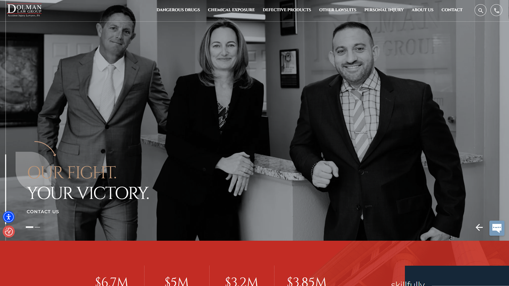
Dolman's homepage hits hard right away. The opening line, “Your fight. Our victory,” paired with lawyer imagery, makes it compelling.
Then, the numbers do the heavy lifting: $400+ million recovered, 400+ settlements beating pre-trial offers, and standout wins like $6.7M for wrongful death and $5M car accident cases.
What works especially well is the balance. It’s aggressive and confident, but grounded in compassion — reinforced by Matthew Dolman’s personal story and the no-fees-unless-you-win promise. This firm's website communicates their built to fight to the finish.
58. The Law Offices of Alyssa Whatley
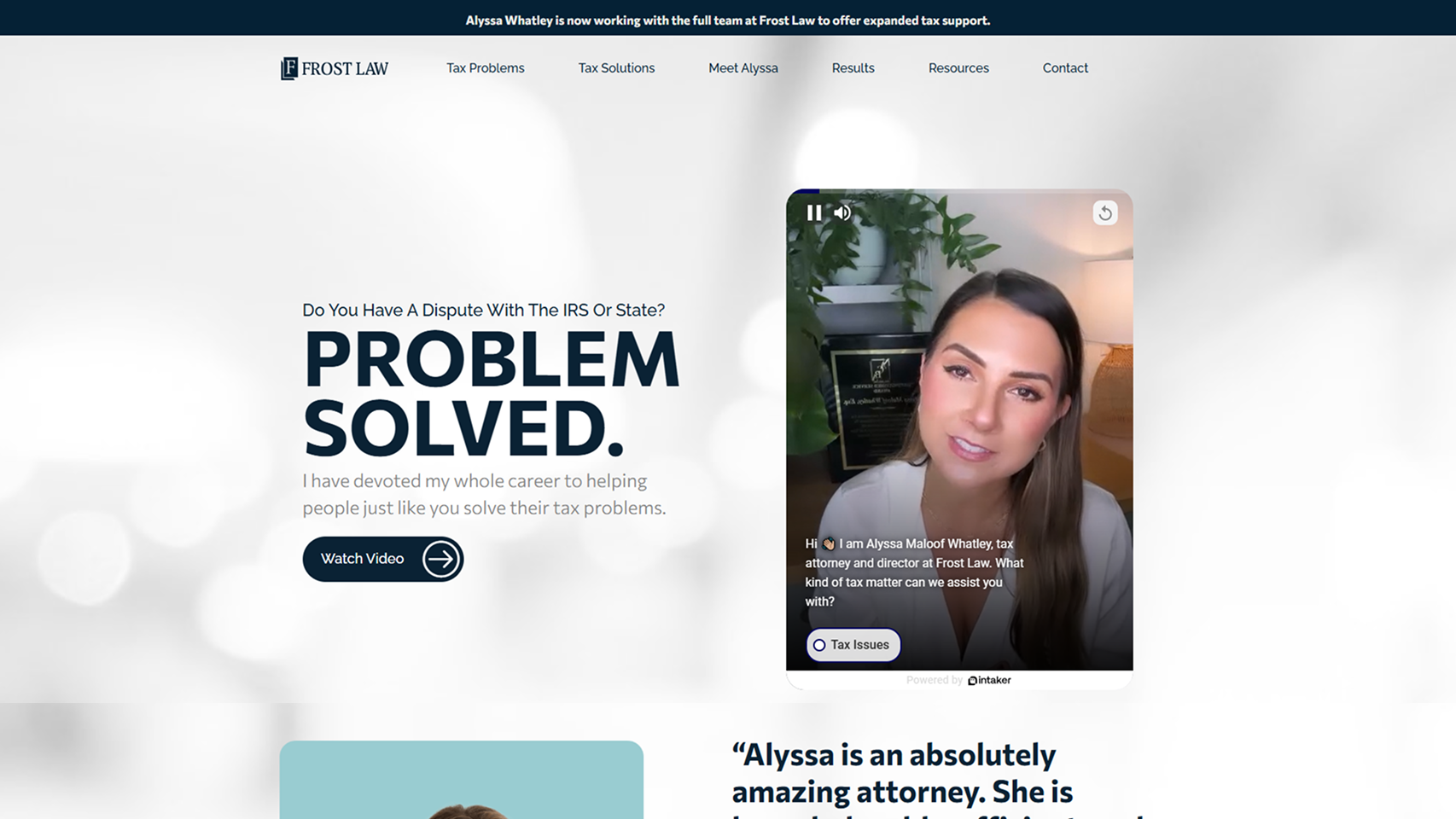
Alyssa's homepage works because it immediately lowers panic. The headline “Do You Have a Dispute With the IRS or State? Problem Solved.” is direct, calm, and reassuring.
Alyssa positions herself personally (“I’ve devoted my whole career…”) while backing it up with proof: $16M+ saved, strong Google reviews, and recognizable badges like Super Lawyers and Avvo.
The structure is clean and confidence-building. It shows you clear problems, clear solutions, and repeated reassurance that she’ll talk to the IRS for you. Hey, we're sold!
59. Hendler Flores Law
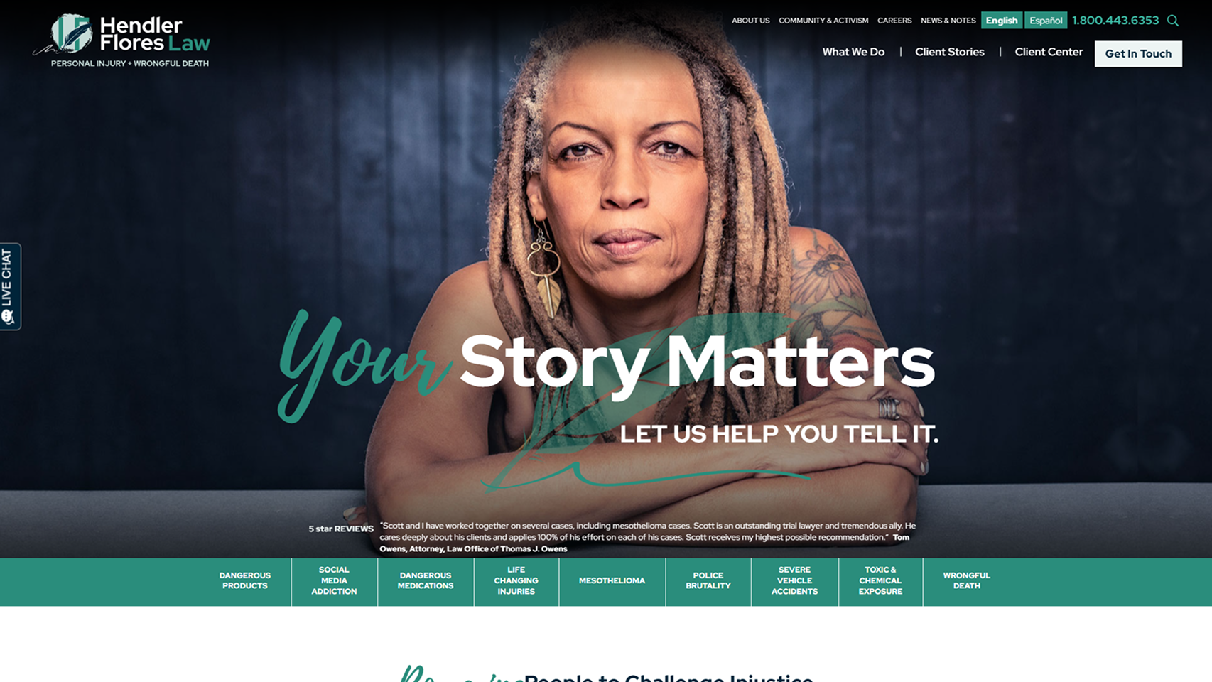
Hendler leads with empathy. The headline “Your story matters. Let us help you tell it.” immediately signals that this firm is about people.
Meanwhile, the messaging consistently centers the client’s voice — grief, anger, accountability, and healing — while reinforcing 30+ years of experience and high-stakes case types.
Rather than pushing outcomes first, they focus on why clients come to them: to be heard, to protect others, and to find closure. Take note that the tone is calm, human, and purposeful. This is what builds trust for people dealing with life-altering situations.
60. Meyers & Flowers
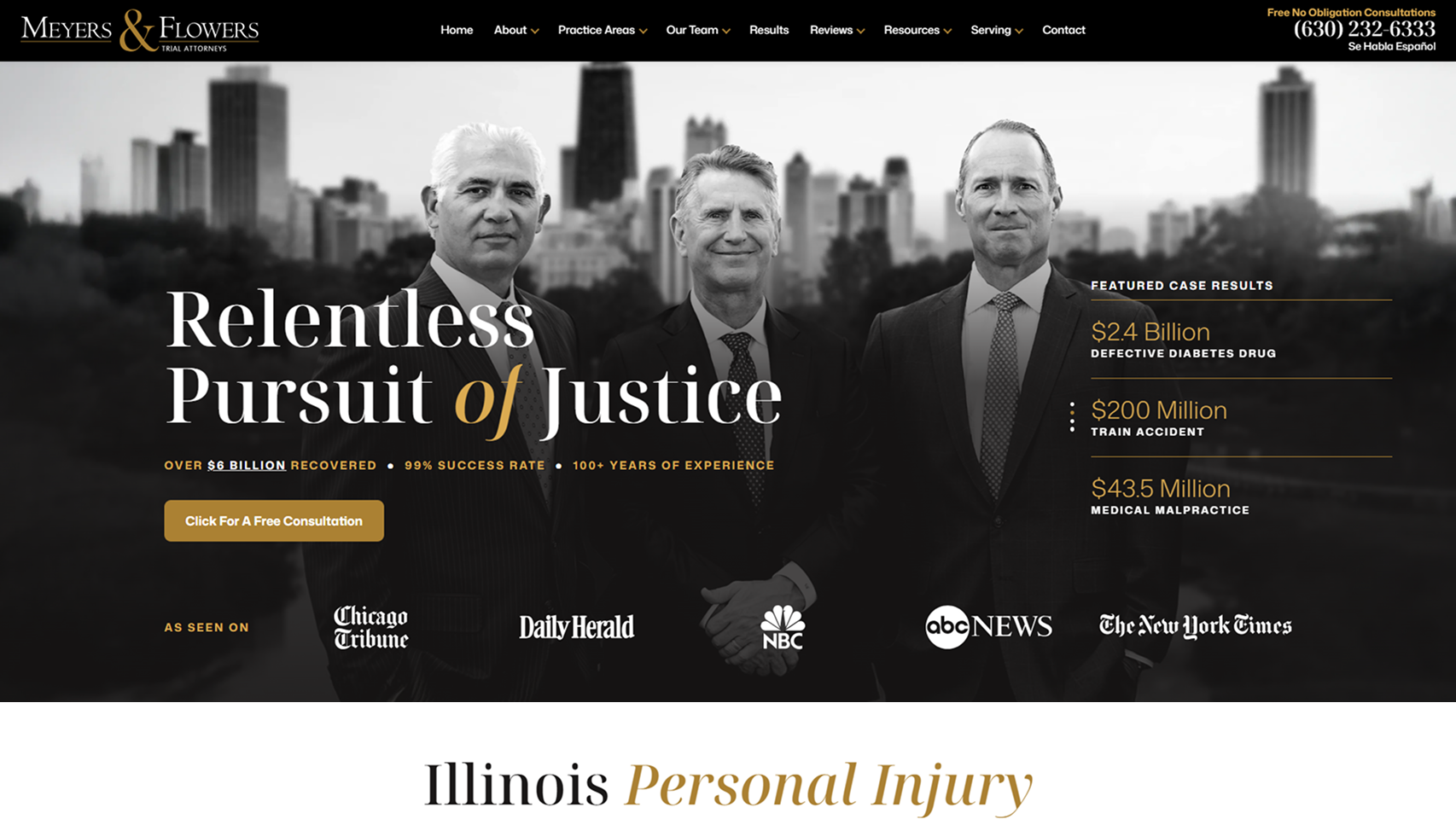
Meyers & Flowers' site is a lesson in luxury. The black-and-gold palette, paired with stark black-and-white attorney photography, is super impressive.
The headline “Relentless Pursuit of Justice” is backed up fast with hard proof: $6+ billion recovered, a 99% success rate, and headline-making verdicts that anchor credibility instantly.
You'll notice that the copy doesn’t rush; it explains why they win — trial readiness, deep resources, and zero intimidation by corporate defendants.
This is a site built to reassure high-stakes clients they’re in formidable hands.
61. Oklahoma Injury Law Firm
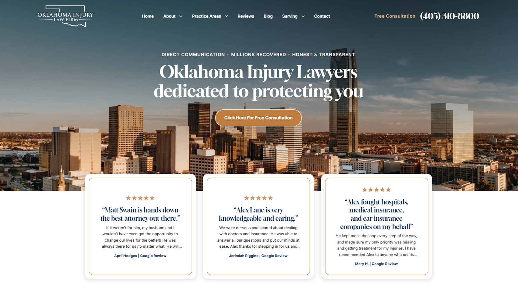
OILF's leads with clarity. The very first line — “Direct communication · Millions recovered · Honest & transparent” — sets expectations immediately.
Instead of vague claims, they anchor trust with named attorneys (Alex Lane, Matt Swain, Stephanie Kaye Corbett) and long-form Google reviews that call out specific actions like "fighting hospitals and insurance companies."
Their messaging reinforces “you work directly with an attorney,” removing a major pain point. Multiple office locations and a simple 2-step case value form lower friction and make taking action feel easy.
62. Kirkland & Ellis
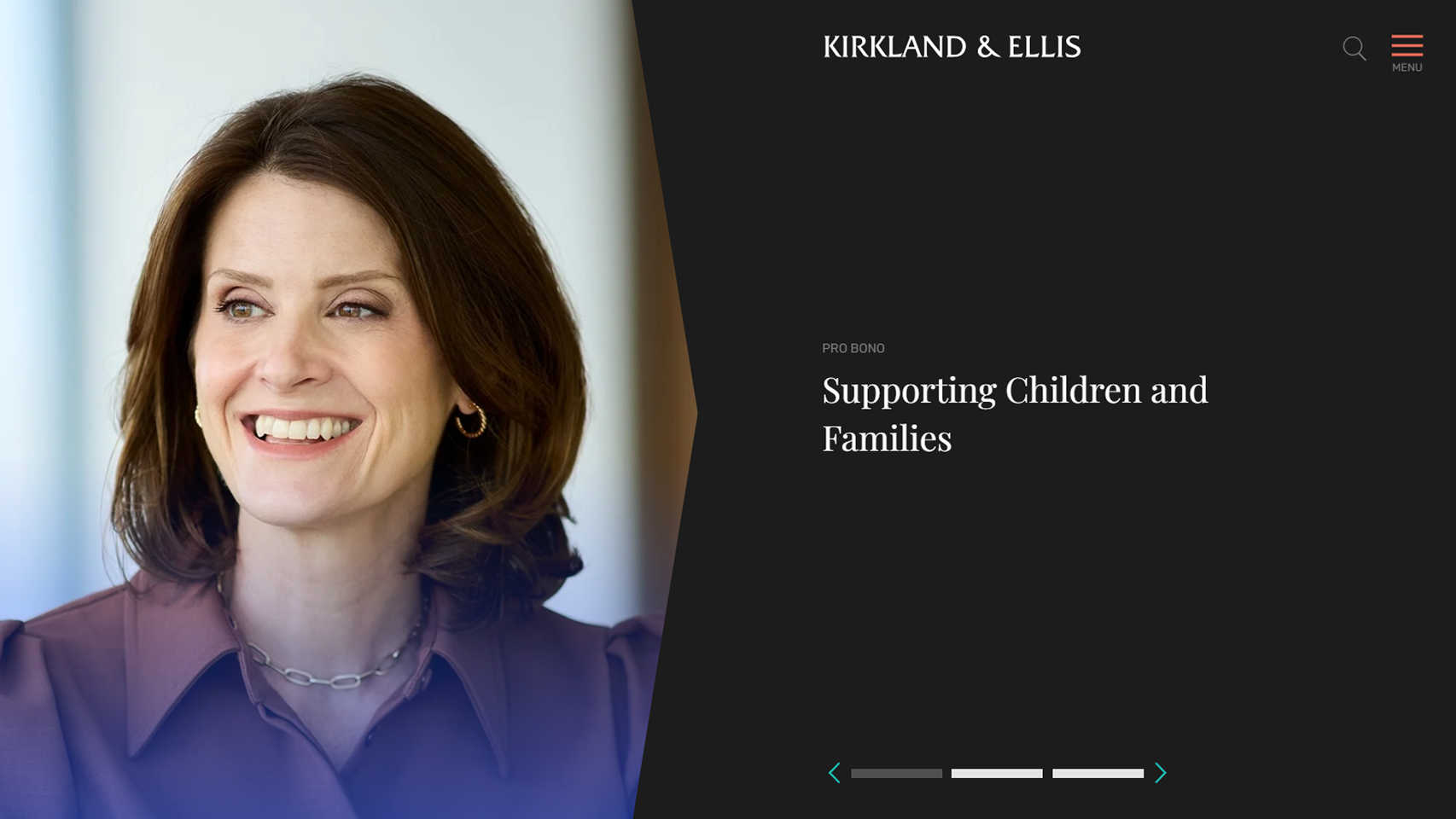
Kirkland’s homepage is intentionally pared back.
Instead of leading with credentials or case wins, it opens with an attorney's portrait and simple, values-driven headlines like “supporting children and families.”
Navigation is deliberately minimal, with the hamburger menu as the primary action, keeping visitors focused on finding info faster (Lawyers, Services, Social Commitment, Careers, etc.)
This site takes the ultimate no-BS approach and positions Kirkland as a firm guided by responsibility and care.
63. Mayer Brown
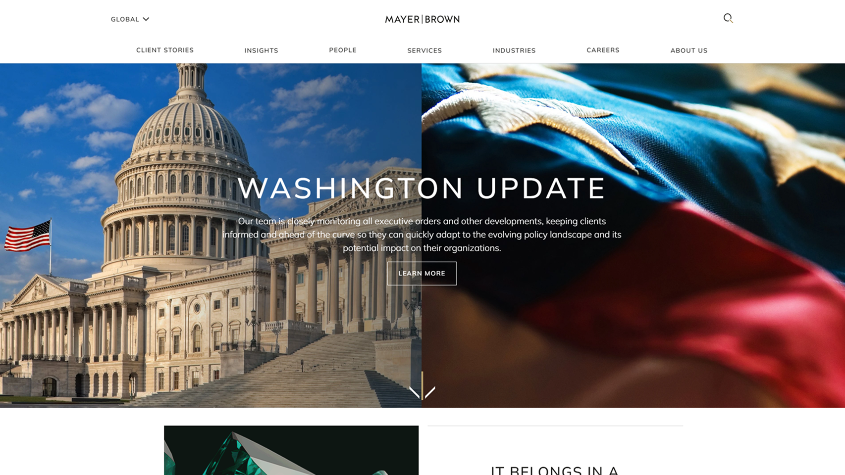
Mayer Brown’s homepage leads with a story. Instead of credentials, it opens on a cinematic client win — repatriating the 840-pound Bahia Emerald after a 20-year legal fight.
From there, everything reinforces authority: client stories, insights, people, and careers are treated as equal pillars. The line “The world’s most sophisticated companies agree…” quietly anchors credibility without overselling.
Mayer Brown positions itself as a firm that handles high-stakes, cross-border problems and prioritizes real outcomes.
64. Baker McKenzie
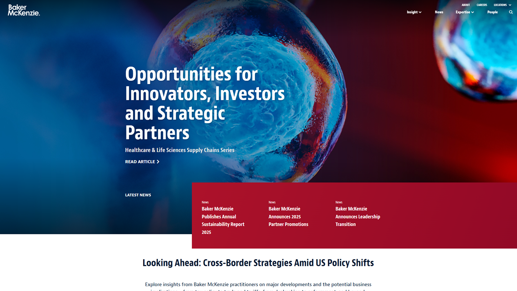
Baker McKenzie’s homepage is built for global operators.
Instead of a hero pitch, it opens with “Opportunities for Innovators..." — a subtle but confident signal that this firm is solution-first.
The navigation does the heavy lifting. Industries, practices, and solutions are mapped cleanly, making it obvious they’re designed for cross-border, multi-jurisdictional work.
That’s backed up by hard proof: 70+ offices, 75% of revenue from multijurisdictional clients, and 1,393 Chambers rankings.
What really stands out is the emphasis on insight over sales: policy shifts, tariffs, ESG, AI, supply chains. Overall, a 10/10 site for their audience.
How We Selected the Best Law Firm Websites
We evaluated each law firm website through a marketing-first lens, focusing on how well it attracts, engages, and converts potential clients.
Every site was reviewed using the same criteria to keep the process consistent and objective.
1. Client Experience
A strong website should guide visitors effortlessly from the first click to the "Contact" button. We looked for clear service explanations, logical navigation, and frictionless contact options that make it easy for prospects to reach out.
2. Branding & Trust
Design builds confidence. We assessed visual consistency, attorney presentation, reviews, and proof elements that reassure visitors they’re in the right place.
3. Authority
High-performing sites establish expertise quickly. Educational content, case results, media mentions, and professional recognition ALL signal credibility and help convert research-stage visitors into qualified leads.
4. Technical Performance
Speed, mobile usability, SEO structure, accessibility, and security all impact lead flow. A site can’t generate cases if it’s slow, hard to find, or frustrating to use.
Want your firm featured next?
Submit your website to info@growlaw.co. If it meets our criteria, we’ll consider it for our next Top Law Firm Websites list.
What Makes an Optimized Law Firm Website Essential in 2026?
Since your law firm's website is often the first point of contact between your firm and potential clients, you need to make sure it is optimized accordingly to benefit from its reach. Below are the criteria we used to identify the best law firm websites on the internet:
- Website design and branding: Your website is a direct reflection of your law firm's brand. A well-designed site conveys professionalism, attention to detail, and competence - qualities that clients seek in legal representation. It involves creating a cohesive visual identity that aligns with your firm's values and resonates with your target audience.
- Website UI / UX: A user-friendly website ensures that visitors can easily find the information they need, whether it's your practice areas, attorney profiles, or contact information. This might include features like intuitive navigation, mobile responsiveness, and fast loading times. Remember, a frustrated user is likely to leave your site and look elsewhere for legal services.
- SEO performance: An optimized website helps your firm appear higher in search results, increasing visibility and attracting more potential clients. This involves more than just keywords; it includes technical aspects like site structure, meta descriptions, and quality content that demonstrates your expertise.
Empowering Law Firms with Web Design
Great law firm websites function as constant sales representatives available 24/7/365. The key takeaway is clear: investing in professional web design is necessary for law firms looking to thrive and have the best lawyer websites. A great website can set you apart from the competition, showcase your expertise, and make a lasting impression on potential clients. It may be hard for you to design your website on your own in terms of expertise, resources, and time. Therefore, it's best to partner with a professional web design agency like Grow Law.
We specialize in creating law practice websites that don't just look good - they perform. Our customized law firm web design services ensure your site stands out among other law firms while effectively communicating your unique value proposition.
Contact us today and let us help you create a website that works as hard as you do.

Compare Your Practice Instantly
Stay Ahead of the Competition!
Compare your law firm's performance to Local competitors with our instant assessment tool
Get a clear picture of your firm's performance
Boost your online presence
Compare My Firm
Compare Your Practice Instantly
Stay Ahead of the Competition!
Compare your law firm's performance to Local competitors with our instant assessment tool
Get a clear picture of your firm's performance
Boost your online presence
Compare My Firm
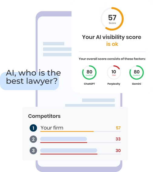
Check Your AI Visibility Instantly
Find Out What AI Is Telling Your Potential Clients
Run our free AI Visibility Report to:
See how often top AI tools mention your law firm
Spot which competitors show up first
Get the next steps to capture more cases
Run My Free AI Report
.avif)
.avif)
.avif)
- Law firm https://en.wikipedia.org/wiki/Law_firm
- Website https://en.wikipedia.org/wiki/Website
- Conversion rate https://en.wikipedia.org/wiki/Conversion_rate_optimization
- Web design https://en.wikipedia.org/wiki/Web_design

