


Table of Contents
With 72,268 family law professionals competing in the United States as of 2023, standing out isn't just an option; it's a necessity. Your law firm's website is the first impression potential clients will have of your practice. It's where trust is built, hope is kindled, and the first steps toward resolution begin. In an era where digital presence can make or break a legal practice, a well-crafted website isn't just about aesthetics—it's about connection, credibility, and compassionate communication.
This comprehensive guide explores the 39 best websites that are redefining digital engagement for experienced family law attorneys. We'll dissect design strategies, user experience principles, and innovative approaches that transform family law attorney websites from mere information portals into powerful client conversion tools.
39 Best Family Law Firm Websites
1. Yarborough Law Group
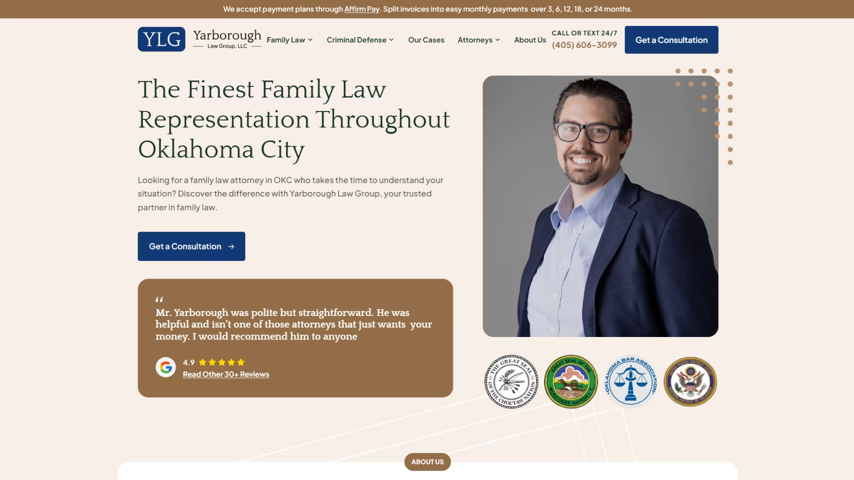
Yarborough Law Group's website design is a compelling blend of professionalism and empathy, creating a welcoming digital space for individuals navigating family law challenges. High-quality images depicting diverse family scenarios add a relatable human touch to their legal services. The prominently displayed contact information encourages visitors to take the crucial step of reaching out. The site opens with a compelling headline that immediately communicates the firm's value proposition, accompanied by impressive Google reviews and legal association emblems that build instant credibility.
Before we created their custom family law website, the firm was generating approximately zero new family law cases monthly. Post-implementation, they've consistently attracted 16 new cases within 12-18 months through targeted search marketing. Learn more about the Yarborough Law Group's achievements!

2. Lishman Law Firm

When prospects are facing challenges at home, the last thing they need is a website that feels like an obstacle course. Lishman Law Firm makes the experience seamless and supportive.
Take note of their site: It's sleek, straightforward, and designed to guide users through tough times with ease. Real client testimonials show just how committed the firm is to providing caring, supportive service.
And the best part: The clear call-to-action for a free case evaluation makes it super easy to take that first step toward getting the help you need.
Lishman Law’s website perfectly balances professionalism with empathy, making it a go-to for anyone in need of reliable legal support.
3. Hodgson Law Office
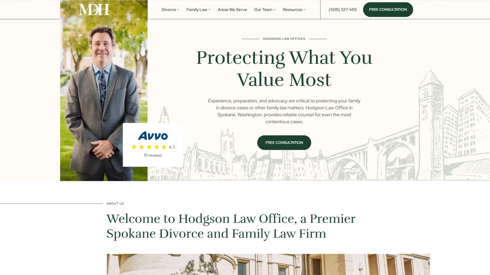
Hodgson Law Office embraces a minimalistic, natural design that feels calming—largely due to the green color palette that evokes the sensation of driving through a forest. Like contemporary law firm websites, they showcase their team across the site, creating a sense of personal connection.
The site balances informative content with intuitive navigation. Carefully placed contact options and calls-to-action make engagement effortless. Our digital marketing efforts have yielded impressive results, generating a 65% increase in non-paid leads and achieving 70 conversions—a testament to the power of thoughtful web design in the family law industry.
Want your firm featured in our next Top Websites list?
Submit your site to info@growlaw.co. Our team will review it, and if it meets our criteria, we’ll proudly showcase it in the next edition.
4. Ylaw Group

The Ylaw Group's family law attorney website breaks the mold of serious legal platforms with its playful and personable approach. The hero image features lawyers engaged in unexpected activities—playing a ukulele, mini-golfing, and reading a newspaper—while maintaining direct eye contact with viewers.
These whimsical images humanize the attorneys, making them appear approachable—a crucial quality for family law professionals. The fun approach helps alleviate the stress typically associated with legal matters, presenting the firm as an understanding partner in navigating challenging situations.
Family Law Websites
5. The Branch Law Firm

True to its name, The Branch Law Firm's website incorporates natural elements, making visitors feel connected to nature as they scroll. Branches, leaves, and flowers are strategically integrated into the design, creating a unique visual experience.
Contact information and menu are prominently displayed, with multiple communication options including AI connect, email, call, and chat. This multi-channel approach ensures potential clients can reach out through their preferred method, enhancing accessibility and user experience.
6. Denver Family Lawyers

Denver Family Lawyers demonstrates a strategic approach to showcasing legal services. Their family law firm website clearly displays the range of family law services they offer, allowing website visitors to explore critical topics like child abuse, spousal support, and criminal defense by navigating through their comprehensive case results.
7. Charles Willmott
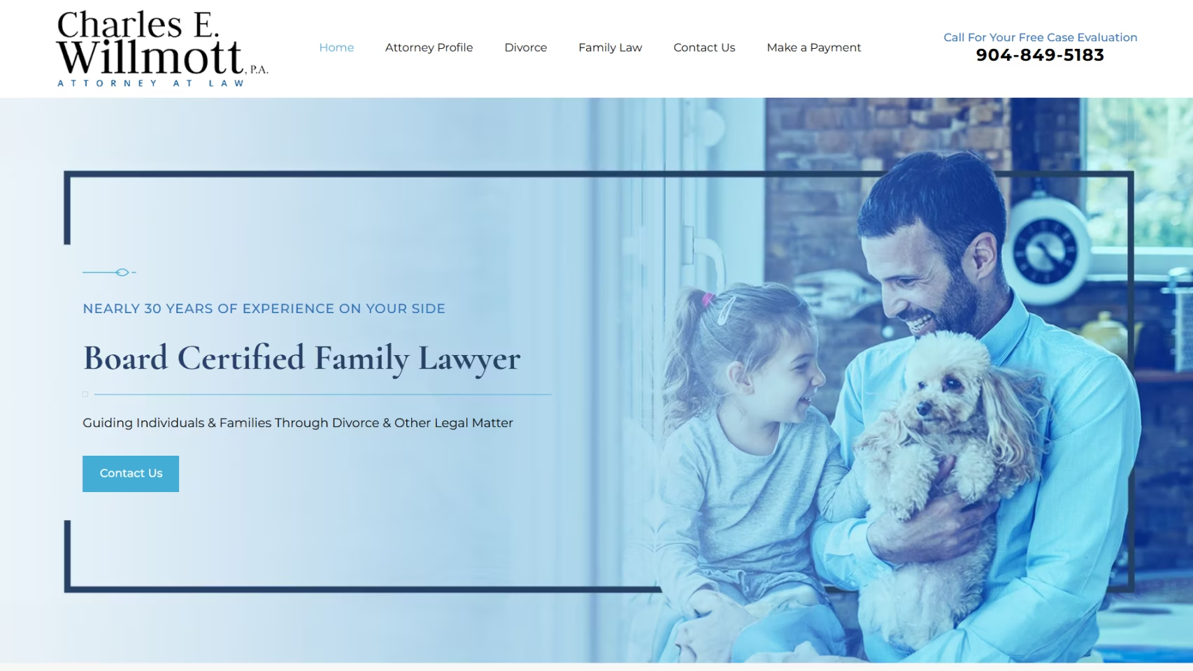
It's easy to see why Charles Wilmott has one of the best websites to help you navigate your family law issues. There are many strong calls to action throughout the site and Charles Wilmott makes it clear that he is a skilled attorney through his listed accolades, the home page, and his attorney profile. Website navigation is easy and you can learn more about his legal representation in a few clicks.
8. Elise Buie Family Law

The hero image of Elise Buie Family Law immediately sets a welcoming tone with smiling people and the headline "When your family is your first priority." A compelling video about prioritizing children's well-being during divorce adds emotional depth. Simple menus, live chat options, and multiple contact methods make reaching out seamless for potential clients
9. Amin Law

Amin Law's website embraces minimalism and accessibility. The hero header avoids information overload, with detailed content revealed through strategic scrolling. A standout feature is their comprehensive accessibility menu, offering options like a screen reader, link highlighting, contrast adjustment, text spacing, and dyslexic-friendly formatting. The ability to change language further demonstrates their commitment to inclusive design.
Best Family Law Websites
10. Emily Rubenstein Law

Emily Rubenstein Law takes a neat, straightforward approach. A hero video showcasing Emily in various settings accompanies a powerful headline: "We know how it feels when everything is at stake. We solve family law problems so our clients can stop worrying and start focusing on their futures." Every element—from contact information to achievements—is meticulously organized.
hose looking for a family law lawyer. They also make it a point to show that they are proud to help the LGBTQ+ community and same-sex couples who might be navigating legal issues.
Need content ideas? Check out our list of high-converting family law blog topics
11. Women's Divorce & Family Law Group

This law firm's website immediately connects with its audience through a compelling image of a woman and child, accompanied by a badge highlighting their decade of experience protecting women's rights. Easily accessible contact information and a unique "roadmap to divorce" with a consultation scheduling option set them apart from traditional family law websites.
12. Lincoln & Wenk Attorneys
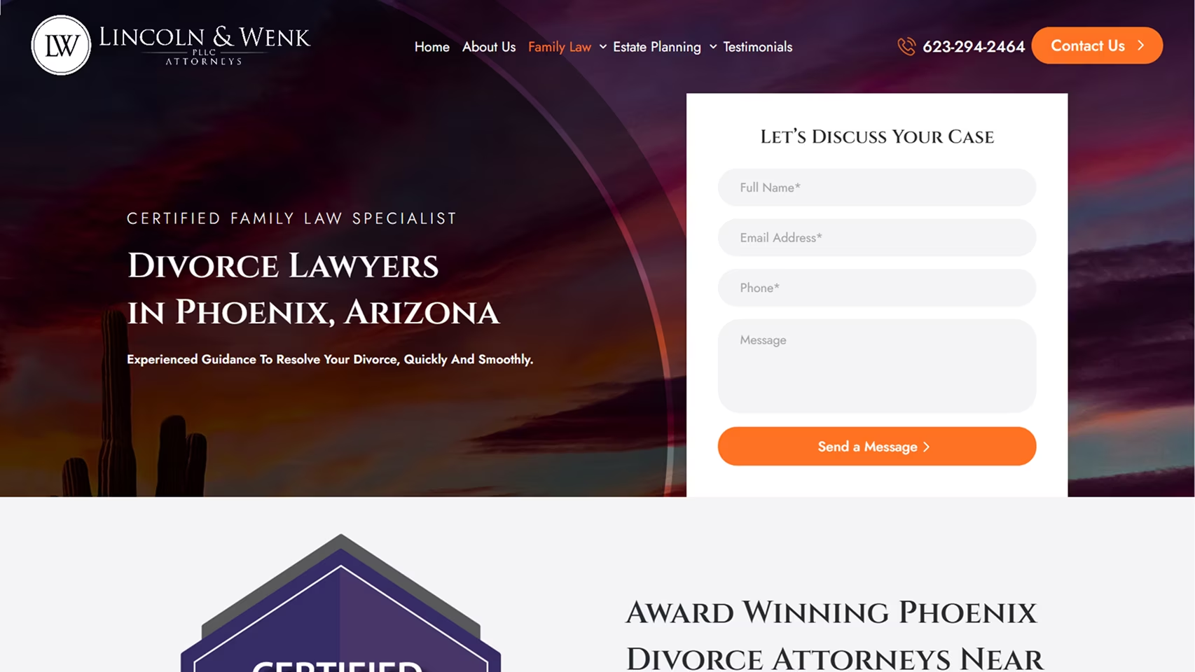
Lincoln & Wenk Attorneys offer multiple contact methods right from the homepage. Their website comprehensively covers family law services including child support, contested and uncontested divorces, same-sex divorce, and military divorces, ensuring potential clients understand their full range of expertise.
13. Arami Law

Arami Law's website greets visitors with a heartwarming image of a father and a smiling child. Scrolling reveals detailed information about the firm, services, and contact options. A unique section provides insights into the divorce process in Illinois, helping demystify family law matters for potential clients.
14. Randal Lowry & Associates

With the bold quote "Divorce can be tough but so are we" accompanied by a rhinoceros image, Randal Lowry & Associates immediately communicates strength and resilience. An innovative navigation arrow quickly directs visitors to their prominent platform awards, showcasing their competitive edge.
Ready to stand out? Explore our best family law marketing ideas today
Divorce Law Websites
15. Sodoma Law

Sodoma Law's website embraces simplicity. A hero image featuring three generations of a family sets a warm, inclusive tone. As visitors scroll, they encounter awards, firm information, principal lawyer profiles, and contact details. Location web pages for their six offices demonstrate their extensive family law coverage.
16. Merel Family Law

Merel Family Law takes a straightforward approach to highlighting strengths. Beyond the standard menu and hero image, they showcase key metrics including years in business, 5-star reviews, clients served, attorneys, and locations—providing immediate social proof of their expertise.
17. Williams Law Group

The Williams Law Group website uses vibrant colors and features a hero image of their lawyers. Scrolling reveals comprehensive information about the firm, services, target clients, location, and contact options. A live chat feature enhances real-time communication with potential clients.
18. Fairway Divorce

Fairway Divorce combines emotional imagery with practical information. A two-minute video introduces attorneys and explains their approach to navigating legal issues. They provide a clear overview of their process, helping potential clients understand exactly what to expect. An extensive accessibility function further demonstrates their commitment to inclusive design.
19. Grand Rapids Family Lawyer

Grand Rapids Family Lawyer features smiling lawyers in the hero image, with prominently placed calls-to-action and contact information. The website provides comprehensive details about the firm and its services and offers a live chat option to facilitate immediate client engagement.
Family Law Website Design
20. Stanchieri Family Law
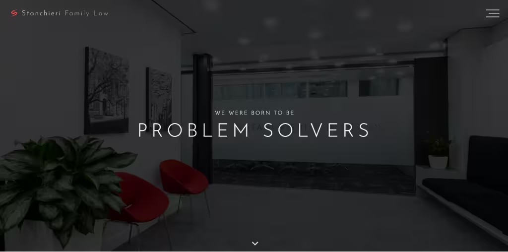
Stanchieri Family Law stands out with its clean, modern design and innovative slide-scroll method. The hamburger menu keeps the top of the page uncluttered, allowing the firm's branding and key messages to take center stage. Concise, impactful information about the firm and its services makes it easy for prospective clients to quickly understand their offerings.
21. Joslyn Law Firm

Looking to create a law firm website that’s both compassionate and professional? Joslyn Law Firm’s site nails it.
With a sleek, modern design that’s easy to navigate, this site is a masterclass in combining client-focused care with professional appeal.
Pay attention to the clear access to services like divorce and custody law, along with the prominent client testimonials. The calm color scheme and intuitive layout make it a welcoming space for anyone in need of legal help.
If your family law firm is aiming to blend empathy with expertise, Joslyn Law’s website is a perfect example to draw inspiration from.
22. Rice Law

You need to check out Rice Law’s website. It's what happens when expertise meets client-focused care.
The design is clean, modern, and highly navigable, with easy access to practice areas like divorce, child custody, and family law. The site’s standout feature is its personalized approach, offering tailored solutions for each client’s unique needs.
You can emulate the use of their client testimonials and the team’s long history in family law. These elements instill trust right away.
Rice Law’s website provides excellent inspiration for lawyers who need to convey a strong sense of authority and personalization.
23. Boudreaux Hunter & Associates

Looking for a family law website that’s welcoming and sharper than a surgeon’s scalpel? Boudreaux Hunter & Associates has it down to an art.
This Houston-based firm’s website strikes the perfect balance between approachability and expertise. With a clean, simple design and easy navigation, it makes finding services like divorce, child custody, and LGBTQ family law a breeze.
The team’s client-first mindset is evident, and real testimonials show just how much they care.
For law firms looking to add personality to their site, Boudreaux Hunter’s website is a great example to draw inspiration from.
24. Myres & Associates

What if you could build a family law website that doesn’t feel like a maze of legal jargon? Look no further than Myres & Associates for inspiration!
This site is smooth like butter, offering clear navigation for everything from divorce to child custody.
What stands out is how the team’s experience and compassion shine through every section... "We take time with each client in an effort to understand their primary concerns and goals." Plus, their glowing testimonials are a testament to how the firm goes the extra mile to get the best results.
Myres & Associates is the perfect blend of polished professionalism and down-to-earth charm.
Best Divorce Law Firm Websites
25. Seattle Divorce Services

Divorce isn’t easy, but navigating the process on a website that feels like a breath of fresh air... that’s Seattle Divorce Services in a nutshell.
This site offers a unique mix of empathy and efficiency. It’s easy to explore, with clear access to divorce, child custody, and mediation services. You won't have to scroll through endless pages of legal jargon.
The firm’s approach is all about problem-solving, focusing on amicable resolutions instead of messy courtroom drama. They’ve also got a team of compassionate experts ready to help you work through the tough stuff, whether you're facing a high-asset divorce or co-parenting challenges.
Seattle Divorce Services' site is about helping clients build a better life after divorce, and their website shows exactly how that’s done.
26. O'Conor Family Law

Ever wish your family law firm’s website felt more like a supportive friend than a cold, corporate ad? O'Connor Family Law delivers just that.
With their motto, “We’ve been there, let us help,” this Massachusetts firm’s website isn’t just about the law, it’s about real people helping real people.
The site’s approachable tone and easy navigation make finding the right resources a breeze, from their free divorce guides to their focus on compassion over combat.
O'Connor Family Law’s site shows how to create a welcoming environment where clients feel heard, understood, and supported every step of the way.
27. Harris Family Law

Tired of family law websites that make you feel like you're reading a legal textbook? Harris Family Law’s site is here to change that!
With 30 years of experience, this Colorado-based firm has mastered the art of providing clear, concise, and compassionate legal help.
The website is designed to guide you effortlessly to essential services like divorce, child custody, and estate planning. But what really sets it apart is their focus on empowering clients with real, practical solutions.
Harris Family Law combines expertise with empathy to make even the toughest cases feel manageable.
28. Shoenberg Family Law Group

What's the first thing that grabs your attention when landing on Schoenberg Family Law Group’s website? The bold claim at the top: "Voted #1 Family Law Firm in California." If that doesn’t make you sit up and take notice, we don’t know what will!
From there, the website doesn’t disappoint. It’s a clean, friendly space that makes navigating complex family law issues feel much easier.
Their “Divorce in California” guide, answering over 350 questions, instantly puts your mind at ease. Whether clients are looking for a peaceful divorce or otherwise, Schoenberg’s got the experience to handle it with care.
If you want a website that’s as impressive as your accolades, visit Schoenberg Family Law Group's site today.
29. Vaught Law Firm

The moment you land on Vaught Law Firm’s website, the bold header text hits you like a truck: "We Understand. We Can Help". This instantly sets the tone for the entire site.
It’s clear, direct, and reassuring, making clients feel that this isn’t just another firm, but a team who gets what they’re going through. Right below that, the line "Award-Winning Law Firm in Austin, TX" lets visitors know they’re in experienced hands.
For any firm looking to create a welcoming, trustworthy vibe right from the first glance, Vaught Law’s homepage header nails it. Use this as a reference point to make your clients feel at ease.
Web Design for Family Lawyer
30. Vogel

Vogel LLP's website immediately grabs your attention with a straightforward, professional vibe. The header — “Family Lawyers Calgary” — makes it crystal clear who they are and who they help, leaving no room for confusion.
The site’s clean layout and no-nonsense copy keep things simple and client-focused. It’s clear that Vogel LLP isn’t just about fighting legal battles; they’re about providing top-tier representation across a range of family law issues.
The use of social proof with 4.8 stars from 146 reviews shows clients that their track record isn’t just about high-profile cases.
Is your law firm aiming to convey authority while remaining accessible? Vogel’s website strikes the perfect balance.
31. The Mandel Law Firm

Want to build a family law website that’s both approachable and authoritative? The Mandel Law Firm site offers plenty of inspiration.
It nails it from the start with their bold header, “Helping people just like you navigate Family Law issues every day.” With over 40 years of experience, they combine expertise with a comforting, client-first approach.
The site offers easy access to their practice areas like divorce, child custody, and alimony, along with helpful blog posts and video guides.
Take note of their clear CTAs and a no-nonsense design. This makes it super easy for visitors to connect, proving that The Mandel Law Firm knows its prospects inside out.
32. Youngberg Law Firm

Is your family law website making clients feel heard, or just overwhelmed?
Compare it to Youngberg Law Firm’s website. They get it right, with a comforting message: “We understand. We can help.”
The site is built for ease. It offers simple navigation with quick access to key areas like divorce, child custody, and mediation.
What really stands out is their “Protect What Matters Most” slogan, which feels personal and tailored to the needs of families. Youngberg Law’s website is a great model as it's clear, client-focused, and straightforward.
33. Arizona Family Law

Arizona Family Law's site is a great example of lawyers using clear, empathetic communication to connect with clients.
The headline, “Peace of Mind... There is No Substitute,” immediately sets the tone, offering a sense of reassurance for clients going through tough family matters.
The site outlines a variety of family law services (from child custody to military divorce) while emphasizing mediation and amicable resolutions.
Take note of the layout. It's intuitive, guiding potential clients through complex information with ease, while still presenting the firm’s expertise in high-stakes divorce cases.
Arizona Family Law provides an excellent blueprint for lawyers looking to craft a user-friendly, informative website.
34. OWLawyers

Looking to build a family law website that balances compassion with professionalism? OWLawyers® shows you how it's done.
With the bold header “The Wise Choice®” right at the top, their site immediately positions the firm as an experienced, trusted partner in what can often be a tumultuous process.
The clean design and practical, informative content make it easy for potential clients to understand their options, whether it's divorce, custody, or mediation. Plus, they give a nod to their expertise with phrases like “Board Certified Family Law Specialists” and awards like “Best Lawyers 2026”.
OWLawyers® is a great inspiration for any law firm looking to showcase its credibility while offering compassionate support.
Family Law Sites for Inspiration
35. Cordell & Cordell
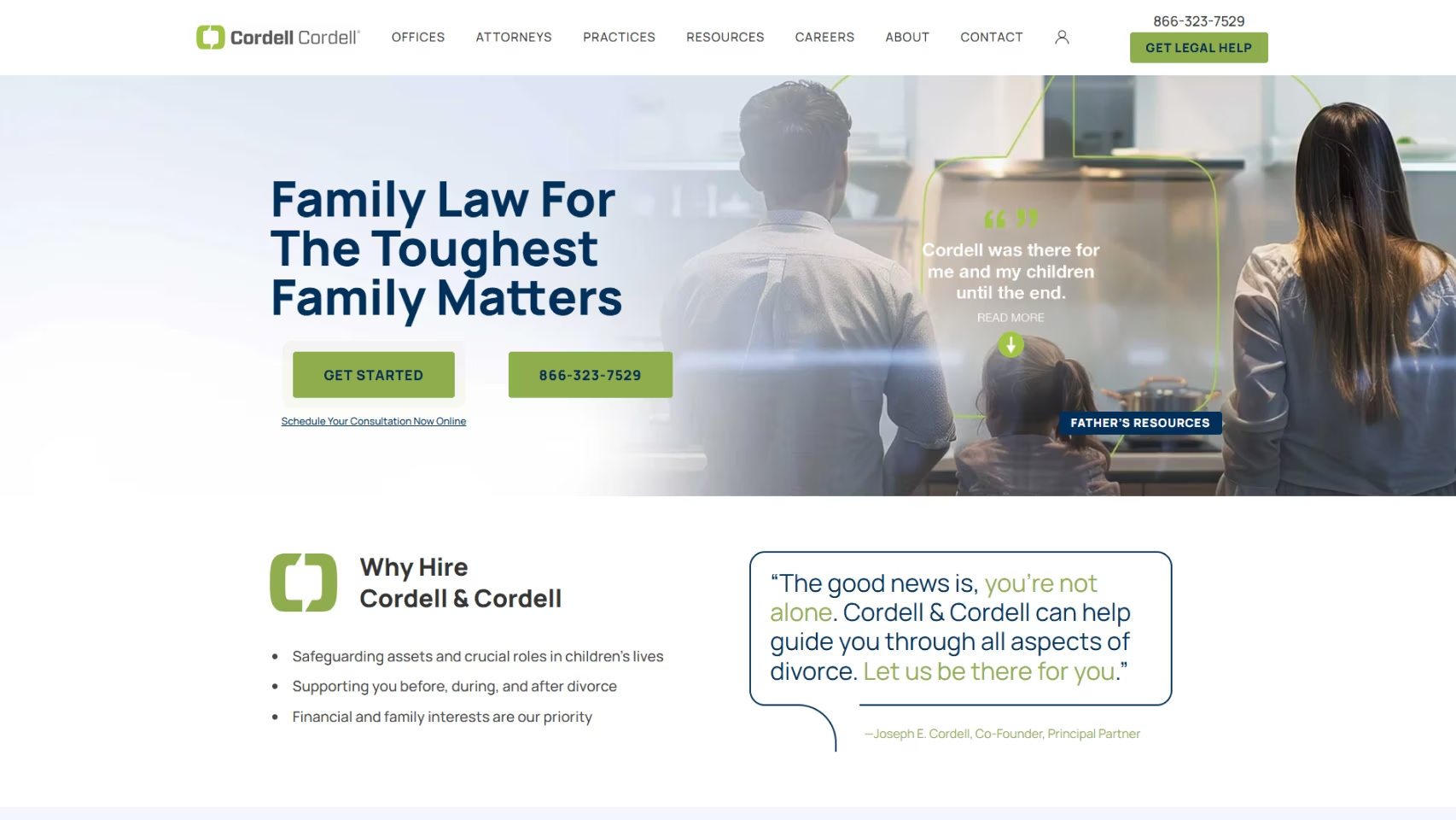
Cordell & Cordell’s homepage knows exactly what families need: reassurance.
With their bold header, "Family Law for the Toughest Family Matters," they immediately prove they get the emotional rollercoaster of divorce. Their promise: “We’re here to support you before, during, and after divorce.”
Their stellar reputation is backed by over 35 years of experience, with 100,000+ clients served, making them the go-to choice for fathers’ rights and complex family law issues. Not to mention their leadership team, including Joseph E. Cordell, are top names in family law.
Cordell & Cordell’s strategy is clear: blend compassion with authority.
36. Anderson Family Law

Anderson Family Law’s homepage is a masterclass in putting clients first.
From the straightforward "First I Listen" tagline to the easy navigation, it’s clear this firm values both transparency and empathy.
The site highlights Ryan D. Anderson’s extensive family law experience while showcasing their commitment to personalized, aggressive representation. Whether you’re dealing with divorce, contested custody, or post-decree modifications, the site makes it easy to understand your options.
Plus, with a simple consultation request form, reaching out is a breeze. Anderson Family Law combines trust with a human touch — a fantastic selling point!
37. Nevada Family Law Group

When we first saw the Nevada Family Law Group's website, we were immediately struck by how personal and direct it feels.
The bold declaration, “Nothing is more important than what we do for families,” really sets the tone, making it clear they are all about protecting what matters most.
Whether clients are dealing with divorce, child custody, or anything in between, their approach is truly compassionate. Plus, offering a free Divorce Guide right off the bat is amazing. That’s the kind of no-nonsense, helpful tone that converts.
Overall, Nevada Family Law Group's layout is easy to navigate, with a focus on the services and resources that matter most to families in need.
38. Kirker | Davis

Have you ever landed on a website and immediately felt like you were in the right place? That’s exactly what happens when you visit Kirker Davis.
The moment you’re on their site, you’re hit with that no-nonsense approach — “Empowering Clients. Achieving Results.” It’s clear: they’re about more than just legal advice.
With a sleek, modern design and straightforward navigation, Kirker Davis makes it easy to see why they’re the go-to firm for high-end family law cases.
39. Levine Family Law

Need a website that’s warm, welcoming, and professional? Levine Family Law’s site is the perfect example!
It makes every client feel understood with easy navigation and a clear focus on family-first values.
The “Let’s Work it Out Together” tone is compassionate, and the simple breakdown of services like divorce, child custody, and prenuptial agreements makes it a breeze for potential clients to find what they need.
Plus, the bright, friendly design makes it stand out without being flashy. Lawyers, take note: this site makes legal challenges feel a little more manageable.
Best Practices for Family Law Websites
Now that we've covered some examples of the best family law websites, it's time to explore additional methods of optimizing your family law marketing. As a leading family law web design agency, we encourage you to implement the below best practices to ensure that your law firm website effectively helps you meet your business goals!
Key Design Elements for Family Law Websites:
- Color Palette
- Images
- Attorney Profiles
- User Experience
- Content
- Mobile-Friendly Design
— Prioritize User Experience (UX)
Your website is more than just eye candy. Think of it like your office lobby.
When potential clients arrive, they’re often stressed and looking for guidance. Your website should instantly give them the confidence that they’re in the right place.
Here’s how to make sure your family law website meets their needs:
- Clear, Easy Navigation: Don’t make them hunt for information. Ensure your website’s layout is intuitive and easy to follow. Visitors should know exactly where to go, no questions asked.
- Mobile-Friendly Design: Most people are browsing on their phones, so make sure your site works flawlessly on smartphones and tablets. A responsive design is a must.
- Fast Loading Times: The faster your site loads, the better. Slow websites frustrate visitors and drive them away. Don’t let that be you!
- CTAs (Calls to Action): Your CTAs should be impossible to miss. Whether it’s “Schedule a Consultation” or “Contact Us,” they should guide visitors to the next step seamlessly.
- Color Palette: Go for soft, calming colors like blues, greens, or pastels. Avoid aggressive colors that might make visitors feel more stressed than they already are.
All in all, be sure to create a user-friendly site that’s easy to navigate, quick to load, and designed for mobile. This will ultimately mean more business for you!

— List All of Your Practice Areas
Family law is a maze of complex, ever-changing issues.
When visitors land on your website, they should immediately see the full scope of services you provide. Make it easy for them to understand their options at a glance.
Here’s how to lay your website out:
- Clear Practice Area Breakdown: Clearly outline each area of law your firm specializes in. Whether it’s divorce, child custody, or adoption, visitors should instantly know what you do and how you can help.
- Comprehensive Coverage: Be sure to include critical areas like:
- Divorce and Separation
- Child Custody and Support
- Adoption
- Domestic Violence
- Prenuptial and Postnuptial Agreements
- Mediation and Collaborative Law
- Guardianship
- Brand and Practice Definition: Your website should show not just what you do, but who you are. Define your practice areas and what sets you apart. You'll make it easier to attract the right leads who need your expertise.
- Prevent Repetitive Inquiries: Specify your areas of expertise across your site. This will mean fewer repetitive questions. Clients will feel more confident knowing exactly how you can help them navigate their legal issues.
To wrap it up, don't just list your services on your family law website. Be warm, welcoming, and compassionate as you guide potential clients toward making the best decision for their situation.
Level Up Your Brand
Find out how much demand there is in your geographical area
Book a Free Consultation

— Create Valuable Content
Nobody’s rushing to Google “divorce lawyer near me” because they’re having the time of their life.
They have questions, which are often urgent in nature.
If you can offer valuable content marketing for law firms that answers their burning questions (without the lawyer jargon), you’ll be the obvious choice.
Here's how to navigate your law firm content marketing:
- Educate Your Clients: People don’t want to guess. Attorney blogs, FAQs, and guides that break down complex topics (like child custody or the divorce process) are your ticket to winning their business.
- SEO Boost: If your content answers questions, it ranks better on Google. Simple math: More helpful content = more search engine love = more leads!
- Engage Your Audience: Talk to your prospects like you know them. Address their fears, questions, and hopes. When you speak their language, they’ll stick around.
- High-Quality Photos: High-quality stock photos are like a good pair of shoes: they complete the outfit. Great visuals make your site feel polished and professional, showing you’re serious about your practice.
So, write, educate, and entertain. Your website will thank you with better engagement and more leads!
— Use Testimonials and Reviews to Build Trust
One of the best ways to show off your legal expertise is to compile testimonials and reviews. When it comes to finding an attorney to handle a legal issue, families want to choose a lawyer who is skilled in their subject matter and has the proof to back it up. Authentic testimonials and reviews are one of the most important tactics to build trust with your target audience and show them that you will handle their case with care.

— Optimize Your Family Law Website for Search
First and foremost, make sure that your law firm website is designed with SEO in mind. In fact, SEO should be the foundation on which your law firm's website is built, and trusted SEO services for law firms can help with that. Rather than starting with a design or a wireframe, map out the content that your site will have and how it can entice site visitors to choose your family law practice.
There are quite a few ways to optimize your site and, over time, these search engine optimization strategies will pay off. We've outlined some ways to make your site SEO-friendly below.
- Conduct targeted keyword research using specialized tools to identify phrases potential family law clients actually use when seeking legal representation.

- Optimize page titles and meta descriptions with precise, compelling language that speaks directly to family law matters.

- Develop high-quality, informative content that naturally incorporates strategic keywords while providing genuine value to potential clients.
- Utilize header tags strategically, structuring content to improve both readability and search engine understanding.

- Implement local SEO tactics, ensuring your geographic service area is prominently featured and optimized.
Read our blog post on SEO for Family Lawyers to learn effective strategies for attracting more clients.
— Make Your Family Law Website Generate Leads
Generating leads is one of the most important goals of your legal website. There are many tactics that you can implement to generate more leads on your site, such as:
- Install online chat features
- Incorporate contact forms throughout your site
- Consider offering some sort of value with your calls to action, such as a downloadable PDF on dealing with divorce, adoption, or other family matters
- Measure how each lead generator is performing to determine where to spend more of your energy and resources
Make Your Family Law Website Stand Out with Grow Law!
Don't risk your growth. Hire a specialized digital marketing agency to get an effective law firm website design.
At Grow Law, we deliver fast, sleek, and client-friendly website designs to boost your visibility and leads significantly.
Our team of 85+ law firm SEO experts position you as the go-to legal expert in your market. Check out some of the impressive results our family law clients see in year 1:
- 3.8x return on investment
- 88% median increase in revenue growth
- 52 average monthly marketing qualified leads
Furthermore, explore the transformative work done with Hagestad Law Group and Omar Ochoa Law Firm.
Don’t miss out on hundreds of potential clients. Let us fill your calendar so you can practice law stress-free.

Compare Your Practice Instantly
Stay Ahead of the Competition!
Compare your law firm's performance to Local competitors with our instant assessment tool
Get a clear picture of your firm's performance
Boost your online presence
Compare My Firm
Compare Your Practice Instantly
Stay Ahead of the Competition!
Compare your law firm's performance to Local competitors with our instant assessment tool
Get a clear picture of your firm's performance
Boost your online presence
Compare My Firm
Check Your AI Visibility Instantly
Find Out What AI Is Telling Your Potential Clients
Run our free AI Visibility Report to:
See how often top AI tools mention your law firm
Spot which competitors show up first
Get the next steps to capture more cases
Run My Free AI Report
.avif)
.avif)
.avif)

