


Table of Contents
You’re paying $50–$100 per click just to send people to your landing page… and what do they find?
A wall of text, a broken form, and a sleepy "Contact Us” button that fades into the page.
Sadly, 97% of law firm landing pages repel prospects. But not yours — not after this!
Here are 10 killer lawyer landing page tricks (with 5 real-world examples) to turn your landing page into a client trap (in a good way).
Your next lead is going to say, “Where have you been all my life?”
First Things First, What Is a Law Firm Landing Page?
It’s not your law firm website home page. It’s not even your Services page.
A landing page for lawyers is a conversion-driven, single-focus page that people land on after they click your ad, your email, or your bio link. It typically looks different from other law firm website design pages.
And unlike the rest of your law firm's website, it’s got one job: To aggressively drive action.
Most landing pages for lawyers are tied to paid ad campaigns, which means you’re spending money to get eyeballs on them. If your page is cluttered or confusing, congrats — you just paid $80 for a polite nope.

Bottom line: A strong lawyer landing page sticks to one offer, one message, and one clear call to action. This is the best way to promote your legal services, even if it means creating separate landing pages for each one.
— 3 Ways to Use Lawyer Landing Pages
Your landing page isn’t just a pretty face — it must wear many hats. Here are 3 smart ways to put it to good use:
1. Book Free Consultations
This is the classic move — offer a no-pressure, free consultation. Keep the form short and the CTA clear: “Book Your Free Case Review” beats “Submit Now” every time.
2. Get Leads from Your Paid Ad Campaigns
Match your ad’s promise word-for-word. If your ad says “Free Divorce Consultation,” your landing page better not start talking about estate planning. Stay focused or lose the lead.
3. Collect Emails from Warm Leads
Not every lead is ready to call. Offer a guide, checklist, or webinar on your landing page in exchange for their email. Then, stay top-of-mind with emails that talk about your unique selling proposition (USP) and other informative material until they’re ready to lawyer up.
Your Revenue Is Going... Going... Gone!
Fix that today. Unlock up to 1,018% more leads with Grow Law.
Book Your Free Consultation Today

How to Create a Lawyer Landing Page that Converts
The competition is brutal. Your prospective clients have options. Nail these 10 high-converting landing page power moves to gain a massive edge.
1. Know the One Action You Want Prospects to Take
Ordering takeout? You don’t scroll through five menus, fill out three forms, and then watch a video about the chef’s journey. You pick what you want and check out.

The same goes for law firm landing pages!
Think: One goal. One message. One clear CTA.
Whether your goal is a phone call, form submission, or a lead magnet download (“5 Things to Know Before Filing for Divorce”), your entire page should be laser-focused on making that one action happen.
P.S. Notice anything about this article? We’ve sprinkled CTAs all over — keeping you clicking, curious, and moving deeper down the rabbit hole.
2. Match the Message to the Market
Would you talk to a panicked car crash victim the same way you’d pitch a startup founder looking to form an LLC?
No? Well, neither does an effective landing page.
Your law firm landing pages need to match both the audience and the ad that brought them there. A Google ad for “car accident lawyer near me” should land on a page that feels urgent, empathetic, and straight to the point.
A Facebook ad for estate planning? That page can afford to be warmer, more thoughtful — even family-focused.
Whether you run a personal injury law firm or otherwise, even a slight disconnect on your landing page will make the prospect bounce. Period.
3. Create an Effortless Landing Page Experience
Have you clicked an ad for shoes… only to land on a homepage that makes you dig through 14 products to find them again?
Never make someone second-guess their click.
If someone taps an ad offering a “Free Case Review for Car Accidents,” they shouldn’t end up on a generic “Our Practice Areas” page.
Here’s what an effortless legal practice landing page experience looks like:
- A headline that matches the ad they clicked
- A clean, uncluttered layout with zero distractions
- One clear call to action that stands out
- Fast load times (because attention spans are shot)
- Simple, no-BS forms
- Trust signals like satisfied client reviews, case studies (client stories), or certifications
- Language that matches mindset to encourage visitors to take action
The legal industry is brutally competitive. Make sure to do these "simple" things on your landing page, and you'll see giant returns.

Be Part of the 1% Who Make Serious Money
Our advanced SEO and PPC services will 4X your law firm's marketing ROI.
Request Your Free Growth Plan Now
4. Show Testimonials and Trust Badges
84% of people trust online reviews just as much as a friend’s recommendation.
Read that again.
On attorney landing pages, trust = conversions. Whether you’re fresh out of law school or rocking a decade of wins, you’ve got seconds to prove you're the real deal.

That’s where social proof comes in:
- Client Testimonials: Use full names and photos if you can. Real faces build real trust.
- Badges & Awards: Super Lawyers, Avvo ratings, “Best Of” wins — show off your street cred.
- Case Results: Share outcomes (with disclaimers): “$350K won in slip-and-fall case.”
- “As Seen On” Logos: Got a media feature? Flex it.
Don’t just say you’re great, show receipts. Whether you want to run a strategic criminal defence landing page or an estate planning landing page... this is important!
5. Make Your CTA Irresistible
Your call-to-action (CTA) button is the moment of truth.
Okay, that's dramatic, but it's true! If it says something weak like “Submit”, you’re losing clients before the form even loads.
A great CTA needs three things: clarity, contrast, and confidence. Be specific:
- “Get a Free, Confidential Case Evaluation”
- “Speak to a Lawyer Within 24 Hours”
Make the button pop with a bold, contrasting color. Only ask for what’s essential in the form: name, contact info, maybe a brief case summary.
Want to reduce friction? Try a multi-step form — short and sweet on the front, details on step two.
And don’t forget the trust signals nearby:
- Visible phone number
- Office address
- Privacy policy link
- Real photos of your team (stock photos scream “sketchy”)

P.S. There are many landing page builders that offer templates to accommodate all these key elements, so it should be easier than you think!
6. Make a User-Friendly Attorney Landing Page
Your landing page has to feel easy. Most people won’t read the whole thing — they’ll decide whether to stay in the first few seconds.

That’s why the top of your page (what they see before scrolling) is key. Start strong with:
- A clear headline that says how you help (your value proposition)
- Case wins or other compelling stats
- A real photo/video of you or your team
On mobile, make sure your page loads fast and looks clean. Put a click-to-call button right at the top so it’s easy to get in touch. This keeps visitors engaged and boosts your firm's credibility.
Fun Fact: People scan web pages in an “F” shape — across the top, down the left, then across again. So lay out your info to guide their eyes.
7. Keep It Simple But Precise
Be honest — Does your law firm landing page read like a resume?
Bad move. Instead, keep it clean, clear, and focused. Use simple language and short sentences — but speak directly to what your prospect is going through.
Instead of listing services like “family law, estate planning, civil litigation,” try this:
- Worried about your custody rights? We’ll help protect them.
- Overwhelmed after a car accident? Let us deal with the insurance company.
Lead with the problem, show that you understand it, then explain how you’ll make it better. That’s what converts visitors!
And ALWAYS bring it home with proof: results, testimonials, or case wins. Simplicity doesn’t mean vague — it means laser-focused on why you’re the right lawyer for them!
Your Lawyer Landing Page Sucks
Seriously, it's costing you prospects. Ready to get expert help and 2X your revenue?
Book Your Free Growth Plan Today
8. Add Video and Other Visuals
Nobody’s reading your whole page, but they will watch a 30-second video.
In fact, lawyer landing pages with video can boost conversions by up to 86%.
A quick intro from you humanizes your firm. A real client testimonial builds instant trust.
Visuals matter too, but always use high-quality photos, not blurry headshots from 2008. Show your face, your team, your results. And we repeat... ditch the stock images!
Bonus: Infographics or quick diagrams can explain complex stuff fast (e.g., “What happens after a DUI").
Bottom line: Show, don’t just tell. That's key with an effective law firm landing page.
9. Make Sure Your Client's Personal Information Is Protected
Be transparent if your landing page collects client information.
Today’s clients are privacy-savvy — and one sketchy form could tank your trust (and conversions). Make sure your lawyer landing page does the following:
- Link to your privacy policy (make it easy to find, not buried in a footer dungeon)
- Add a checkbox confirming they agree to it
- Include a short statement on how you protect their info — no legalese
- Slap on any trust badges (like antivirus or SSL seals) for extra credibility
Also, if you’re targeting clients in Europe or using email signups, the General Data Protection Regulation (GDPR) applies. Don’t ignore it.
10. Perform an A/B Test
Your lawyer landing page isn’t a post-and-ghost deal. Want more conversions? You’ve got to test what actually works — one tweak at a time.
A/B testing means creating two versions of the same page with a single difference, and seeing which one gets more clicks, calls, or form submissions.
Things to test:
- Headline (is it bold enough?)
- CTA button color or text (“Submit” vs. “Get My Free Case Review”)
- Hero image (you vs. stock photo guy)
- Form length (3 fields vs. 6 — guess which wins?)
The goal? Optimize every inch of your lawyer landing page until it converts more visitors into booked consultations.
Your Choice: Leads or Leaks?
Fix your landing pages and gain up to 1,018% more leads.
Book Your Free Strategy Call Now
Top 5 Best Law Firm Landing Pages
Okay, let's get to the fun part!
Here are 5 lawyer landing pages that are brilliantly made. We'll break down what makes them conversion-friendly and where they can improve.
— Applewhite Law Firm
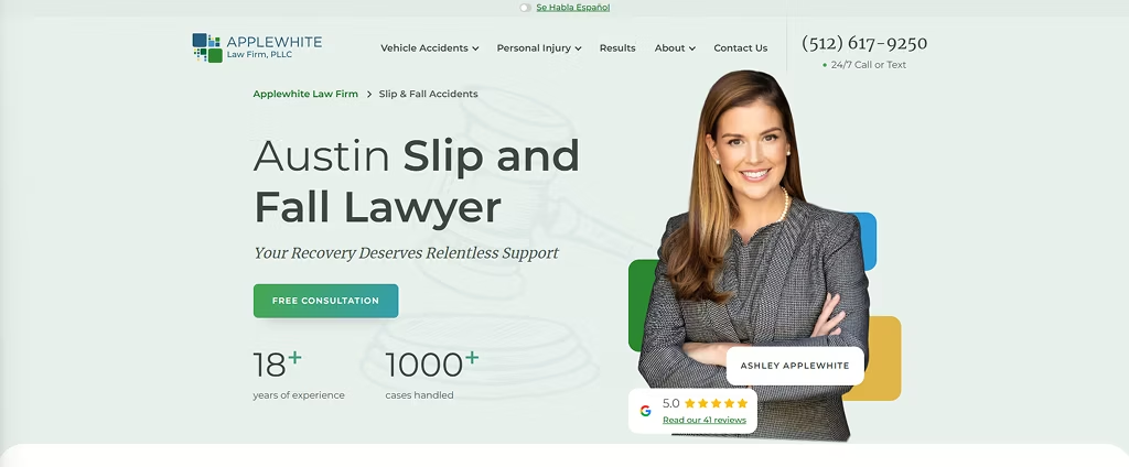
Summary:
This is a dedicated landing page targeting slip and fall victims in Texas, with a clear offer for a free consultation and strong personal branding from Ashley Applewhite.
What They Do Well:
- Strong, benefit-driven headline (“Your Recovery Deserves Relentless Support”)
- The personal story builds authority and trust (insurance defense background)
- Tons of social proof: 5.0 rating, 41 reviews, case results
- Call/text number is prominent and 24/7 — great for urgent cases
- Visual hierarchy is clean, skimmable, and mobile-device-friendly
Room for Improvement:
- The form could test a multi-step version to reduce friction
- No video — even a 30-second attorney intro could dramatically boost conversions
— HaGestad Law Group
.avif)
Summary:
This Montana lawyer landing page nails estate planning: professional tone, strong trust signals, and positive testimonials. It’s calm, credible, and built to win over cautious prospects.
What They Do Well:
- Clear headline with a strong emotional hook: “Secure Your Future”
- Strong track record — "30+ years of combined experience" and "millions of dollars saved"
- Excellent social proof: Google, Avvo, Yelp, Martindale, and NextDoor ratings
- Good use of FAQs and educational content (especially around wills, trusts, and Medicaid planning)
- Strong repetition of “Free Consultation” CTA with clear contact info
Room for Improvement:
- Text-heavy above the fold — the first section could benefit from a stronger visual hierarchy
- CTA buttons don’t stand out visually — no bold contrast or urgency
— Yarborough Law Group
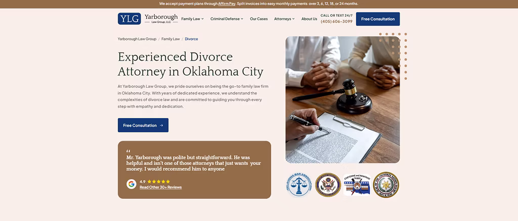
Summary:
This Oklahoma City landing page targets divorce and family law clients with a clear, local appeal. It blends empathy, straightforwardness, and heavy social proof.
What They Do Well:
- Strong trust-building: 30+ glowing testimonials, 4.9 rating
- Great use of "Call or Text 24/7" — perfect for high-emotion, urgent cases
- Copy feels human — especially in highlighting Cole’s background and personal story
- Nicely tailored FAQs to the local divorce process
Room for Improvement:
- The headline could be more benefit-driven (“Get Peace of Mind in Your Divorce” vs. “Experienced Divorce Attorney”)
- The form is a bit long — they could test a shorter version or a multi-step flow
— Lehmbecker Law
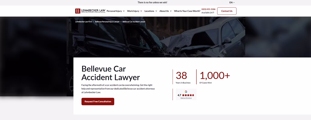
Summary:
This page flexes its authority with stats, settlements, and decades of experience. It’s a classic personal injury landing page built for high-intent users — serious tone, serious proof, and serious results.
What They Do Well:
- Opens strong — "1,000+ cases won" and "There is no fee unless we win!"
- Super informative, with a lot to guide the reader
- Smart use of local stats to show relevance and authority in Bellevue
Room for Improvement:
- CTA buttons could be punchier — “Contact Us” feels sleepy
- Missing a hero image that shows a lawyer/client to humanize the firm
— Jacob D. Fuchsberg Law Firm
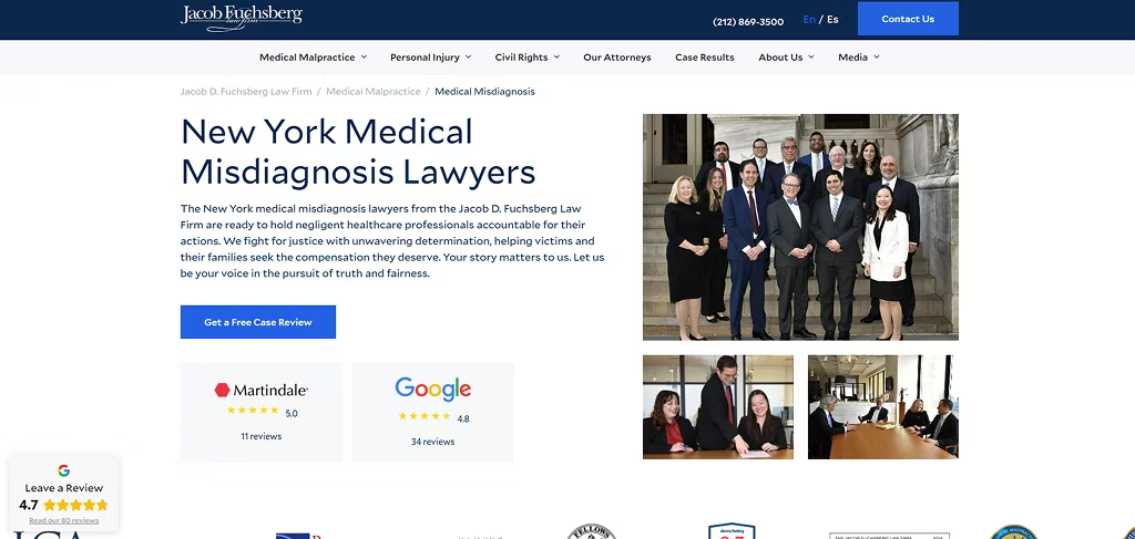
Summary:
This landing page positions the firm as empathetic, experienced, and justice-driven. It’s rich in content and shows authority with strong verdicts, previous client reviews, and a human-centered voice.
What They Do Well:
- Emotional, client-first messaging
- Great live chat option and sticky form to drive consultations
- Powerful case results and testimonials
- Anchored navigation at the top lets users instantly jump to key sections of the page.
Room for Improvement:
- Page is text-heavy — more visuals could help break it up
- Even a 30-second video would help humanize the brand
That's a Lot to Handle Yourself. Contact Us Instead.
Don't waste time writing your own landing page.
Let our experts, who’ve built 100+ high-performing law firm campaigns, do it for you, while you focus on winning cases.
Grow Law is an award-winning law firm SEO agency in Chicago. Our team of 70+ specialists offers ROI-first law firm SEO services, lawyer PPC management, and web design services to:
- Unlock up to 1,018% more qualified leads
- Deliver a 400% to 800% return on your marketing investment
- 2X your revenue with a fully booked calendar
Book Your Free Consultation Today
...Or keep losing prospects to your competitors.
FAQs

Compare Your Practice Instantly
Stay Ahead of the Competition!
Compare your law firm's performance to Local competitors with our instant assessment tool
Get a clear picture of your firm's performance
Boost your online presence
Compare My Firm
Compare Your Practice Instantly
Stay Ahead of the Competition!
Compare your law firm's performance to Local competitors with our instant assessment tool
Get a clear picture of your firm's performance
Boost your online presence
Compare My Firm
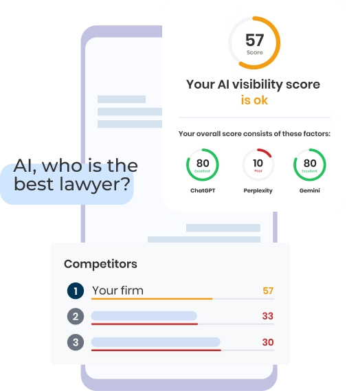
Check Your AI Visibility Instantly
Find Out What AI Is Telling Your Potential Clients
Run our free AI Visibility Report to:
See how often top AI tools mention your law firm
Spot which competitors show up first
Get the next steps to capture more cases
Run My Free AI Report
.avif)
.avif)
.avif)

