FREEGet your personalized marketing assessment in 1 minute

Law Firm UX Design: Best Practices for Websites That Turn Visitors Into Clients

Sasha
Sasha Berson

Co-Founder & CGO, Grow Law

Clock icon

12 min

read

Pen icon

Published:

4/29/2026

Updated icon

Updated:

4/29/2026

Table of Contents

    Law firm UX design — user experience design — is the architecture of how a prospect moves from landing on your website to picking up the phone and calling.

    Most law firm websites are designed to look impressive. The best ones are designed to convert. These are different goals, and confusing them is the reason thousands of law firms spend money on traffic that never becomes clients.

    This guide covers why UX determines lead generation, the trust signals that convert legal prospects, how navigation and information architecture should be structured, where mobile UX fails law firms most, how CTA design and conversion optimization work, and the technical usability factors that set the floor for everything else.

    Why Law Firm UX Design Determines Whether Your Website Generates Leads

    Law firm UX design is not about aesthetics — it's about the friction between a prospect's intent and the action you want them to take. A prospect searching for "criminal defense attorney near me" has high intent.

    If they land on your site and can't immediately find a phone number, can't tell if you handle their type of case, or have to scroll past three paragraphs of firm history to find a CTA — they leave. 

    88% of potential clients won't return to a poorly loading or difficult-to-use website. That's not a traffic problem. That's a UX problem.

    A criminal defense firm came to Grow Law with strong local SEO rankings but a 78% homepage bounce rate. Visitors were arriving from search and leaving within seconds.

    A UX audit identified four issues: no headline that communicated who the firm helps, no visible phone number above the fold on mobile, a contact form buried at the bottom of the page, and attorney photos that undermined credibility.

    After a homepage redesign — clear practice-area headline, phone number prominent above fold, CTA button visible without scrolling, professional photography, and three trust signals in the first viewport — the bounce rate dropped to 41%, and consultation requests increased 140% without changing traffic.

    The lesson is consistent across every legal website audit: law firm website UX is not a design preference — it's a revenue system.

    Law firm website usability — how easily a visitor can find information and take action — determines conversion rate as much as any marketing channel. Every friction point between arrival and contact is a lead lost.

    See how Grow Law designs law firm websites built for conversion: law firm website design

    The UX Elements That Drive Trust on Legal Websites

    Legal website UX has a trust problem that most other industries don't. A prospect considering hiring an attorney is making a high-stakes, often emotionally charged decision. They arrive at your website already skeptical of the legal process, of marketing promises, and of whether any attorney will actually care about their case.

    Trust isn't built by reading your about page. It's built in the first three seconds based on what they see.

    The trust signals that legal website UX must surface in the first viewport:

    UX Element Where It Belongs What It Signals to the Prospect
    Attorney photos (real, professional) Homepage hero, attorney bio pages, practice area pages This is a real person who will handle my case — not a faceless firm
    Verifiable credentials Homepage, attorney bio, footer Bar admissions, years of experience, certifications — this attorney is qualified
    Case results/verdicts Homepage, practice area pages, attorney bio This firm has won cases like mine — there's evidence of competence
    Google reviews/ratings Homepage, near CTAs Other people trusted this firm and had good outcomes — social proof
    Peer recognition badges Homepage, attorney bio Super Lawyers, Best Lawyers, AV Preeminent — third-party credibility
    Practice clarity Hero section, navigation I can tell immediately whether this firm handles my type of case

    A firm that implemented every one of these trust signals in the right locations achieved a 1,354% increase in qualified leads, a 1,927% boost in conversions, and 2,900% more organic traffic.

    The design humanized the firm through attorney photos, detailed service overviews, and media mentions — making clients feel confident before they ever read a word of content.

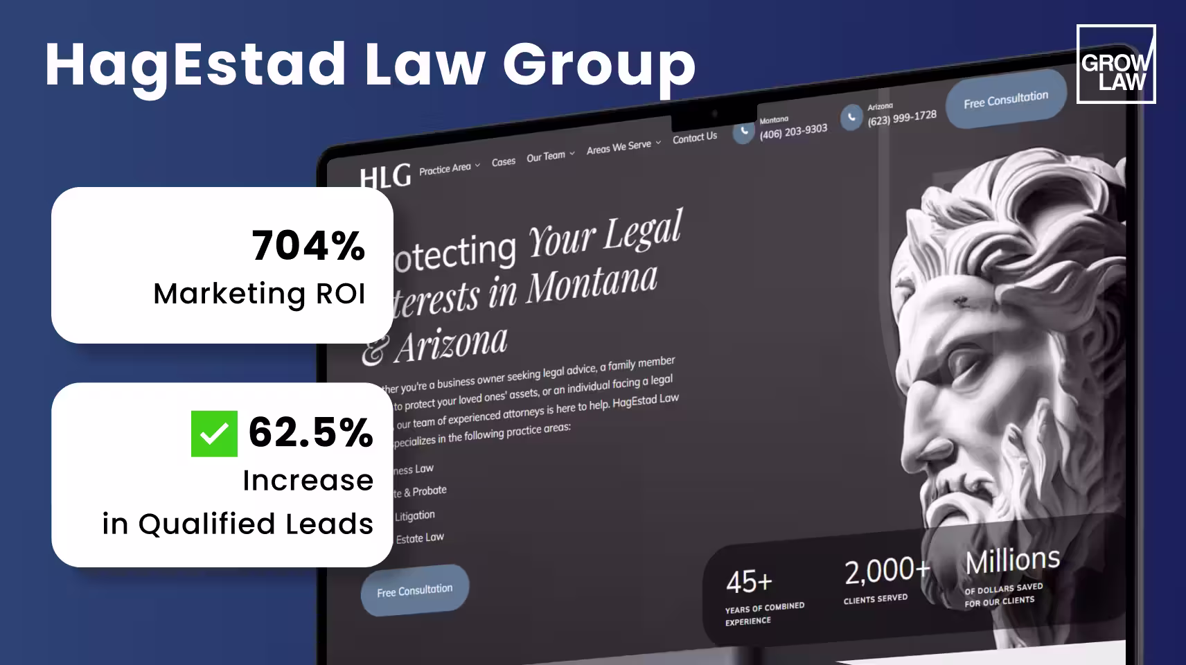
    HagEstad Law Group's website exemplifies this approach: clean gray-white design, a bold headline that immediately communicates value, dozens of 5-star reviews visible on scroll, $10M+ cases resolved prominently displayed, and 95% win rate with 50 years of combined experience surfaced in the first viewport.

    The result: 704% ROI, 62.5% more marketing-qualified leads, and a 39% drop in cost per lead.

    HagEstad Law Group

    Navigation and Information Architecture for Law Firm Websites

    Law firm website navigation fails most often for the same reason: it's organized around how the firm thinks about itself rather than how a prospect searches for help.

    A firm that organizes navigation as "About Us / Practice Areas / Attorneys / Blog / Contact" is forcing the prospect to figure out where their problem fits.

    A prospect with a DUI charge doesn't want to find 'Practice Areas' — they want to see "DUI Defense" in the first menu.

    Firm-First vs. Client-First Navigation
    Navigation Element Good UX Practice Common Law Firm Mistake
    Top navigation items 5–7 items maximum; lead with practice areas, not firm information 8+ items; "About Us" before "Practice Areas"; generic labels
    Practice area labels Use client language: "Car Accident Lawyer", not "Personal Injury" Legal terminology that clients don't search for
    Primary CTA in header Phone number AND "Free Consultation" button visible at all times, even on scroll CTA only at the bottom of the page; no visible phone number in the header
    Mobile hamburger menu Large tap target, opens with one tap, closes easily Small icon, multi-level menus that require multiple taps
    Footer Full practice area list, attorney names, locations, contact methods — secondary navigation for deep pages Only address and copyright — wasted trust-building real estate

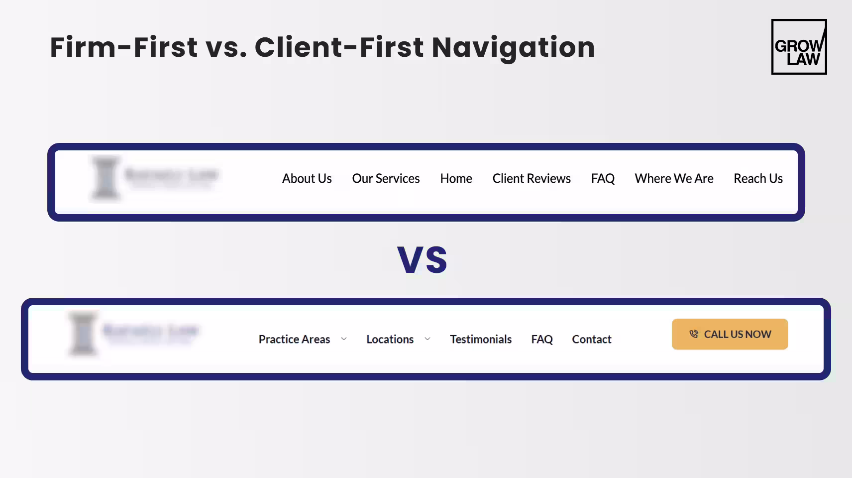
    The information architecture principle for law firm websites: organize content around what the client is going through, not around what the firm does.

    A prospect with a divorce case is experiencing a life crisis — they're not shopping for "Family Law Services."

    Navigation that acknowledges their situation ("Divorce," "Child Custody," "Asset Division") converts at higher rates than navigation that categorizes services for the firm's convenience.


    Mobile-First UX: Where Most Law Firm Websites Lose Clients

    Over 50% of organic traffic to law firm websites comes from mobile devices. For local legal searches — "DUI attorney near me," "personal injury lawyer [city]" — that figure is significantly higher.

    Most of that traffic arrives on a phone, in the moment the prospect decides to act, and leaves within 10 seconds if the experience is poor. Law firm website usability on mobile is not a secondary concern — it is the primary conversion environment.

    A personal injury firm's website received 68% of its traffic from mobile, but was built for desktop. 

    On mobile, the navigation was broken, the contact form required pinching and zooming to complete, and page load time was 8.2 seconds. 60% of mobile visitors were leaving within 10 seconds.

    After a mobile-first redesign — responsive layout, tap-friendly buttons sized for thumbs, simplified three-field contact form, and page speed reduced to 2.1 secondsmobile conversion rate increased 210% within 3 months.

    The firm went from losing the majority of its mobile traffic to converting it at rates comparable to desktop.

    Mobile UX Element Required Standard How to Test
    Page load time Under 3 seconds on 4G; target under 2 seconds Google PageSpeed Insights — mobile score 90+
    Phone number Tap-to-call link — every occurrence of the phone number on mobile Test on actual device: Does tapping the number open the dialer?
    Contact form 3–4 fields maximum; no pinching required; large input fields Complete the form yourself on a phone without zooming
    Navigation Hamburger menu with large tap target (44px minimum); single-tap open; no hover states Test with thumb on phone — can you navigate one-handed?
    CTA buttons Full-width or near-full-width; minimum 44px height; sufficient contrast GTmetrix or BrowserStack — check button tap targets
    Text readability 16px minimum body text; no horizontal scrolling required Test without zooming — is all text readable?
    A law firm website that loads in 8 seconds on mobile isn't just slow — it's losing 60% of its highest-intent visitors before they see a single word of content.

    CTA Design and Conversion UX for Law Firm Websites

    Best practices for law firm website UX around CTAs come down to one principle: make the next step obvious and frictionless at every point in the visitor's journey.

    Most law firm websites have one CTA — a contact form at the bottom of the page.

    The prospect who scrolls there has already decided. The firms that convert more are the ones whose CTAs reach the prospects who are still deciding.

    Cameron Law came to Grow Law in April 2024 with an outdated site structure and weak CTAs throughout. Visitors were arriving from search, but the site had no clear conversion path — content ended without direction, and forms were buried.

    After overhauling the CTA architecture alongside the content structure, the firm saw a significant increase in qualified leads and conversion rate. The CTA changes were as important as the content changes.

    CTA Element Best Practice What to Avoid
    Primary CTA placement Above the fold on every page — visible before scrolling Only at the bottom of the page; requires scrolling to find
    CTA copy Specific and benefit-focused: "Get Your Free Case Review," "Speak to an Attorney Today" Generic: "Contact Us," "Learn More," "Submit"
    Trust reinforcement near CTA "No Fee Unless We Win," "Free Consultation," "24/7 Availability" — reduce hesitation CTA standalone with no context or trust signal
    Form length 3–4 fields: name, phone, case type. Email optional. Nothing else. 10-field forms asking for case details before first contact
    Phone number visibility Prominent in header, sticky on mobile, repeated at every CTA block Phone number only in the footer or the contact page
    Response time signal "We respond within 1 hour" or "Available 24/7" near form No indication of when the firm will respond
    Grow Law builds law firm websites with conversion-focused UX from first viewport to final CTA: attorney website design services

    Law Firm Website Usability: Page Speed, Accessibility, and Technical UX

    Law firm website usability is the technical layer beneath the design. A visually excellent website with poor usability scores loses leads before the prospect ever evaluates the content.

    The relationship is direct: poor page speed, broken accessibility, and Core Web Vitals failures all suppress both rankings and conversion rates simultaneously.

    Firm Website Usability

    The starting stat: 88% of potential clients won't return to a website that loads poorly or is difficult to use. That's not a marginal risk — it's the majority of second-chance opportunities gone.

    For legal websites where trust is everything, a slow or broken experience signals incompetence before the content can signal expertise.

    Technical Element Target Standard Testing Tool
    Page load speed Under 2.5 seconds desktop; under 3 seconds mobile. LCP (Largest Contentful Paint) under 2.5s. Google PageSpeed Insights; GTmetrix
    Core Web Vitals — LCP Under 2.5 seconds. Compress hero images; use lazy loading for below-fold content. Google Search Console → Experience → Core Web Vitals
    Core Web Vitals — CLS Under 0.1. Avoid layout shifts from late-loading images, fonts, or ads. Chrome DevTools → Lighthouse
    Core Web Vitals — INP Under 200ms. Reduce JavaScript execution time; defer non-critical scripts. PageSpeed Insights; Chrome DevTools
    Accessibility (WCAG 2.1 AA) Color contrast ratio 4.5:1 minimum; all images have alt text; keyboard navigable; screen reader compatible. WAVE Accessibility Tool; axe DevTools
    HTTPS / security SSL certificate valid; no mixed content warnings; HSTS enabled. SSL Labs Server Test; browser padlock check
    Cross-browser compatibility Test in Chrome, Safari, Firefox, Edge — especially on iOS Safari (dominant mobile browser for legal searches). BrowserStack; manual testing on iPhone

    Grow Law's goal is a 4X return on investment in web design for every client — and clients who execute a full UX and technical optimization have seen up to 400% traffic growth within one year. Lead generation increases by over 900% after complete web presence redesigns. The technical layer isn't the exciting part of web design, but it's what determines whether everything else works.


    Summary

    • Law firm UX design is a revenue system — every friction point between a prospect's arrival and their decision to contact the firm is a lead lost. A 78% bounce rate dropped to 41%, and consultations increased 140% after one homepage UX fix.
    • Legal website UX must surface trust signals in the first viewport: attorney photos, case results, reviews, credentials, and practice clarity. These signals are evaluated in 3 seconds — before the prospect reads content.
    • Law firm website navigation should be organized around client situations, not firm structure. Practice areas should be accessible in one click; the primary CTA must be visible at all times.
    • Over 50% of legal website traffic is mobile. Law firm website usability on mobile — load speed, tap-friendly forms, visible CTAs — is the primary conversion environment for most practice areas.
    • Best practices for law firm website UX around CTAs: visible above the fold on every page, specific benefit-focused copy, trust reinforcement adjacent, 3–4 field forms, phone number prominent in header.
    • Technical usability — page speed under 2.5s, Core Web Vitals passing, WCAG accessibility, HTTPS — sets the floor for everything else. 88% of potential clients won't return to a poorly performing site.
    Ready to build a law firm website that converts visitors into consultations? Law firm web design agency


    Frequently Asked Questions

    • What is law firm UX design?

      Law firm UX design is the practice of structuring a legal website so that visitors move efficiently from arrival to contact. It covers the visual hierarchy, navigation architecture, trust signal placement, CTA positioning, mobile responsiveness, and page speed that collectively determine whether a prospect who lands on the site calls the firm or leaves. Law firm UX design is distinct from visual design — a site can look professional and still have UX that suppresses conversions.

    • What are the best practices for law firm website UX?

      Best practices for law firm website UX include: surfacing trust signals (attorney photos, reviews, case results) in the first viewport; making the primary CTA visible above the fold on every page; organizing navigation around client situations rather than firm structure; optimizing for mobile first (50%+ of legal traffic is mobile); keeping contact forms to 3–4 fields; targeting page load time under 2.5 seconds; and testing all UX decisions on an actual mobile device.

    • How do you improve UX on a law firm website?

      How to improve UX on a law firm website starts with a conversion audit: identify the pages with the highest traffic and the lowest conversion rate, then run a heatmap and session recording analysis to see where visitors are dropping off. Fix the highest-impact issues first — phone number visibility, CTA placement, page speed, and mobile form usability. These four changes produce the most measurable improvement in consultation rate without requiring a full redesign.

    • What is the difference between law firm website UX and usability?

      Law firm website UX is the broader discipline — encompassing design, information architecture, content strategy, and the emotional experience of navigating the site. Law firm website usability is a specific subset focused on whether visitors can accomplish their goals without friction: find information, complete a form, reach the firm by phone. Good UX produces a site that feels right; good usability produces a site that works right. Both are required for conversion.

    • Why does UX matter for law firm websites?

      UX matters for law firm websites because 88% of potential clients won't return to a site that loads poorly or is difficult to use, and legal prospects are making high-stakes decisions under emotional pressure. A poor UX signals that the firm doesn't pay attention to detail — the same quality judgment prospects apply to legal representation. Firms with strong UX convert traffic into consultations at rates 2–3x higher than firms with poor UX, regardless of the quality of their legal services.

    • How do you improve usability on a law firm website?

      How do you improve usability on a law firm website focuses on five technical areas: page load speed (target under 2.5 seconds using PageSpeed Insights), mobile responsiveness (test every form and CTA on an actual phone), navigation simplicity (5–7 top-level items, client-language labels), contact accessibility (phone number tap-to-call, form visible without scrolling), and Core Web Vitals (LCP, CLS, INP passing in Google Search Console). Fix these five areas, and usability improves measurably.

    • What UX mistakes hurt law firm website conversions?

      What UX mistakes hurt law firm website conversions are consistent across audits: phone number not visible or not tap-to-call on mobile; contact form buried below the fold or requiring too many fields; no trust signals (reviews, case results, attorney photos) in the first viewport; page load time over 3 seconds; navigation using legal terminology instead of client language; and no CTA on blog posts or practice area pages — leaving high-intent visitors with no clear next step.

    Compare My Firm

    Compare Your Practice Instantly

    Stay Ahead of the Competition!

    Compare your law firm's performance to Local competitors with our instant assessment tool

    • Get a clear picture of your firm's performance

    • Boost your online presence

    Compare My Firm

    Compare My Firm

    Compare Your Practice Instantly

    Stay Ahead of the Competition!

    Compare your law firm's performance to Local competitors with our instant assessment tool

    • Get a clear picture of your firm's performance

    • Boost your online presence

    Compare My Firm

    AI Grader

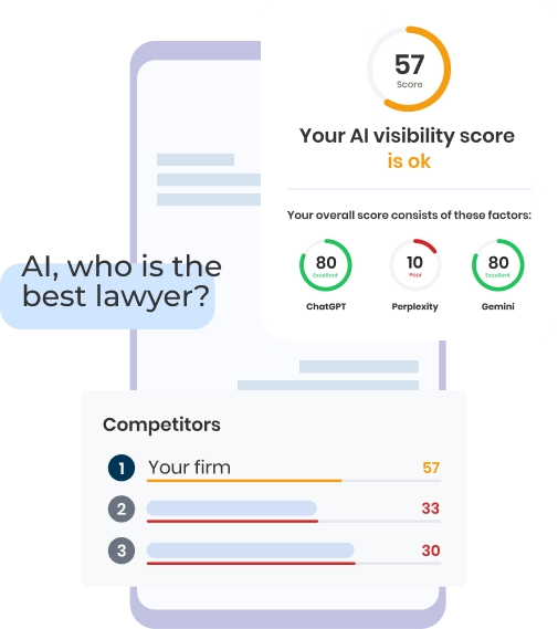
    Check Your AI Visibility Instantly

    Find Out What AI Is Telling Your Potential Clients

    Run our free AI Grader to:

    • See how often top AI tools mention your law firm

    • Spot which competitors show up first

    • Get the next steps to capture more cases

    Run My Free AI Report

    Background

    Turn Your Law Firm Into a $10M Sellable Asset — in 60 Minutes

    Learn the 5 systems top 3% of attorneys use to scale, exit, and stop being the bottleneck.

    • $500 value — FREE for the first 50 registrants
    • Bonus: Get a $499 Growth Plan if you book within 24 hours

    Book Your Spot

    April 1 | 3:00 PM ET | Live Online

    City viewSasha

    Calculate the Cost of SEO for Your Website

    Please complete all the fields to receive an instant price quote for SEO optimization of your website.

    Please Select

    Your Customized SEO Packages

    Incremental growth for small firms with a limited budget

    Mid-size firms ready to fill their calendar with qualified leads

    Any law firm serious about aggressive & sustainable growth

    *Please be aware that all provided estimates are preliminary and subject to refinement following an in-depth discussion about your project and a comprehensive gathering of your specific requirements.
    **Connect with our SEO specialist to explore our ongoing packages designed to enhance your website's visibility and searchability, ultimately leading to an increase in customer engagement and conversion rates.
    Thank you! Your submission has been received!
    Oops! Something went wrong while submitting the form.

    Calculate the Cost of Your Website

    Please fill all fields to get your result

    Does your website need integrations with specific tools or systems:
    *Please be aware that all provided estimates are preliminary and subject to refinement following an in-depth discussion about your project and a comprehensive gathering of your specific requirements.
    **Connect with our SEO specialist to explore our ongoing packages designed to enhance your website's visibility and searchability, ultimately leading to an increase in customer engagement and conversion rates.
    Looking to split the payment?
    Pay for your website in 24 incremental payments (0% Finance)
    Deposit $3,500
    Thank you! Your submission has been received!
    Oops! Something went wrong while submitting the form.

    4ffb9ccd744271471b1feb9af43274a11da6dd9ae1cbe2389501b6b96327ab06960bb8020e01e8de93c64510023fd34f